Visual Rhetoric
Charity Website
1-week Design Sprint
[2023]
Overview
I led the design of a donation landing page for PAWS, a Toronto-based animal charity. Using visual storytelling and rhetorical techniques, I created an experience that builds trust, highlights their mission, and encourages small but meaningful acts of support.
My Role
Research, Conceptualization, Content Writing, Visual Design, Prototyping, User Testing
Team
Solo Designer
Duration
1 Week (Design Sprint)
Introduction
Donation pages ask for support, but few make people feel why it matters.
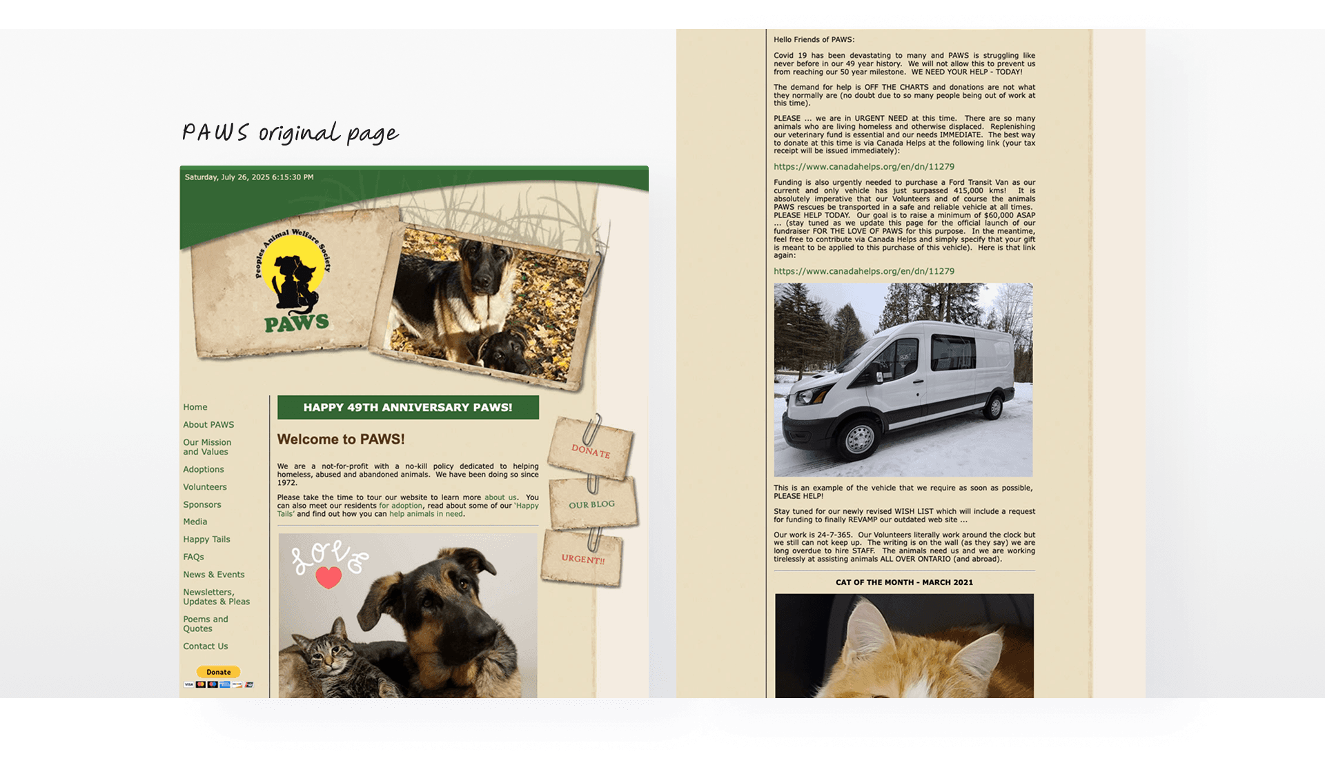
When I came across PAWS, I felt their mission was strong but the message didn’t come through clearly. Their donation page had the right intention, but it lacked warmth and structure. I wanted to create a page that felt more personal. Something that helps people understand the cause and feel good about supporting it.
But, what does PAWS do?
PAWS is a Toronto-based animal welfare charity that rescues, shelters, and rehomes abandoned or abused animals.
Since 1972, they’ve followed a no-kill policy and provided care through vet services, adoption support, and community outreach. Their work relies entirely on donations from individuals who believe every animal deserves a second chance
The Problem
The mission resonated with users, but the current page lacked urgency.
I spoke with two animal lovers who shared a simple truth. They cared about the animals, and believed in the mission. But, when it comes to donations, many just closed the page and left. Then what was the reasons for it?
Lack of emotional hook
The existing page shared their mission, but didn’t help visitors connect emotionally or feel the impact of their support.
Unclear call to action
There was no strong prompt to donate. The button felt passive, and nothing guided users toward taking action.
Disorganized content
Messages about the organization and its purpose were scattered, making it hard to follow or stay engaged.
Design Challenge
How might we help motivate more animal lovers to donate while providing them with trust and reliable information about the charity?
To guide my design, I established these two goals before starting conceptualization.
Competitor Research
Using emotion intentionally to build trust and clarity
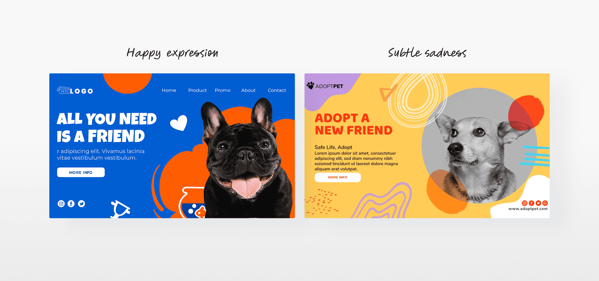
When I looked at other charity websites, I saw two common approaches. Some used sad, heartbreaking photos to make people feel guilty. Others focused only on happy stories to keep things light. I didn’t fully agree with either.
Visual Concept
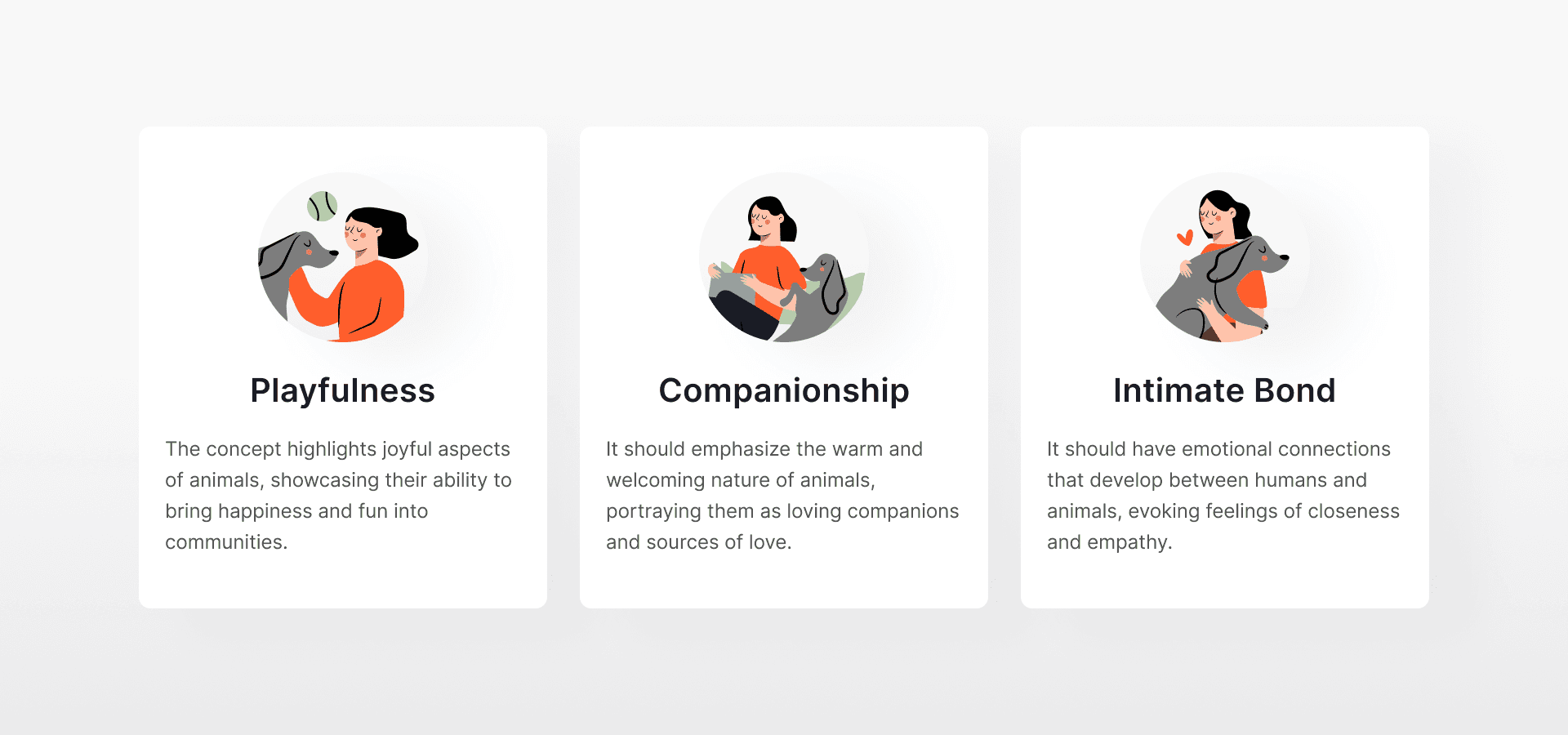
Emotional tone through playful, caring, and trust-building themes
I picked these because they reflect how we naturally connect with animals. They make us happy, they give us love, and they deserve to be cared for. I wanted the tone to feel warm and honest, without making people feel guilty. These ideas helped me keep the message kind, clear, and emotionally real.
Content Restructure
Reorganizing content to focus on clarity, connection, and action
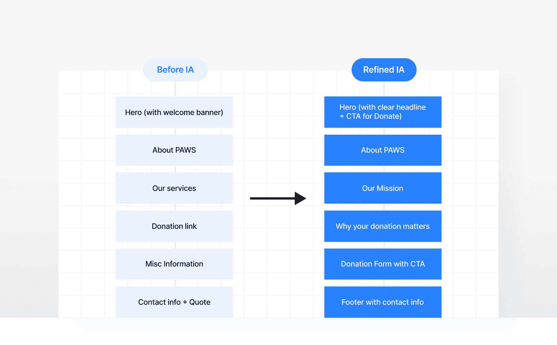
The existing page seemed structured like a blog post or newsletter with mixed messages and no clear priority. It relied heavily on long paragraphs without hierarchy. So, I reorganized the content and planed to write new copy based on the original.
Ideation
Turning ideas into visual language
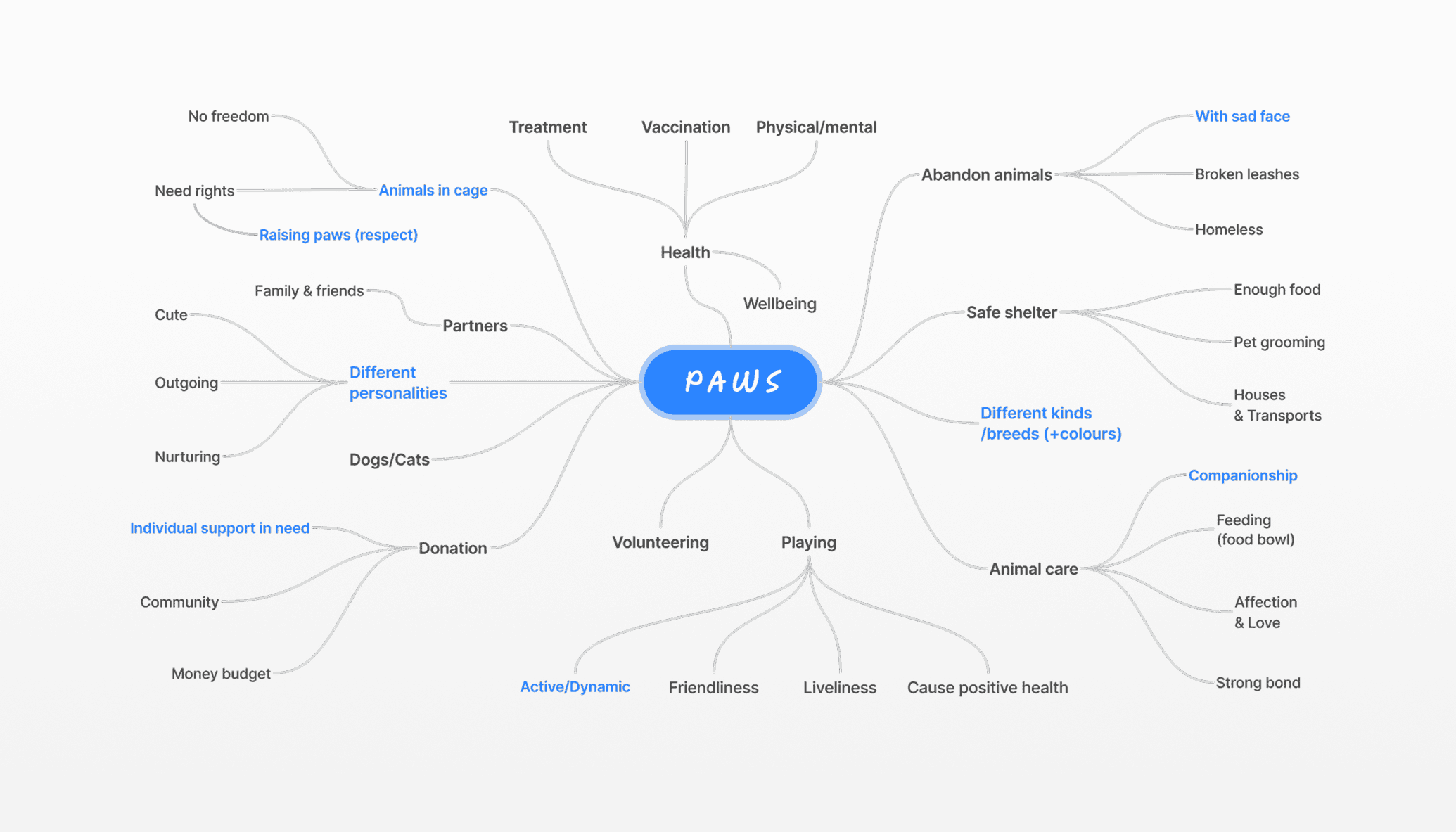
I started by mapping out themes like abandonment, shelter, donation, and hope. Then I sketched simple visuals like paws, food bowls, broken leashes, animals in cage, and dogs raising their paws. I chose these because they were easy to understand and showed need in a gentle, emotional way.
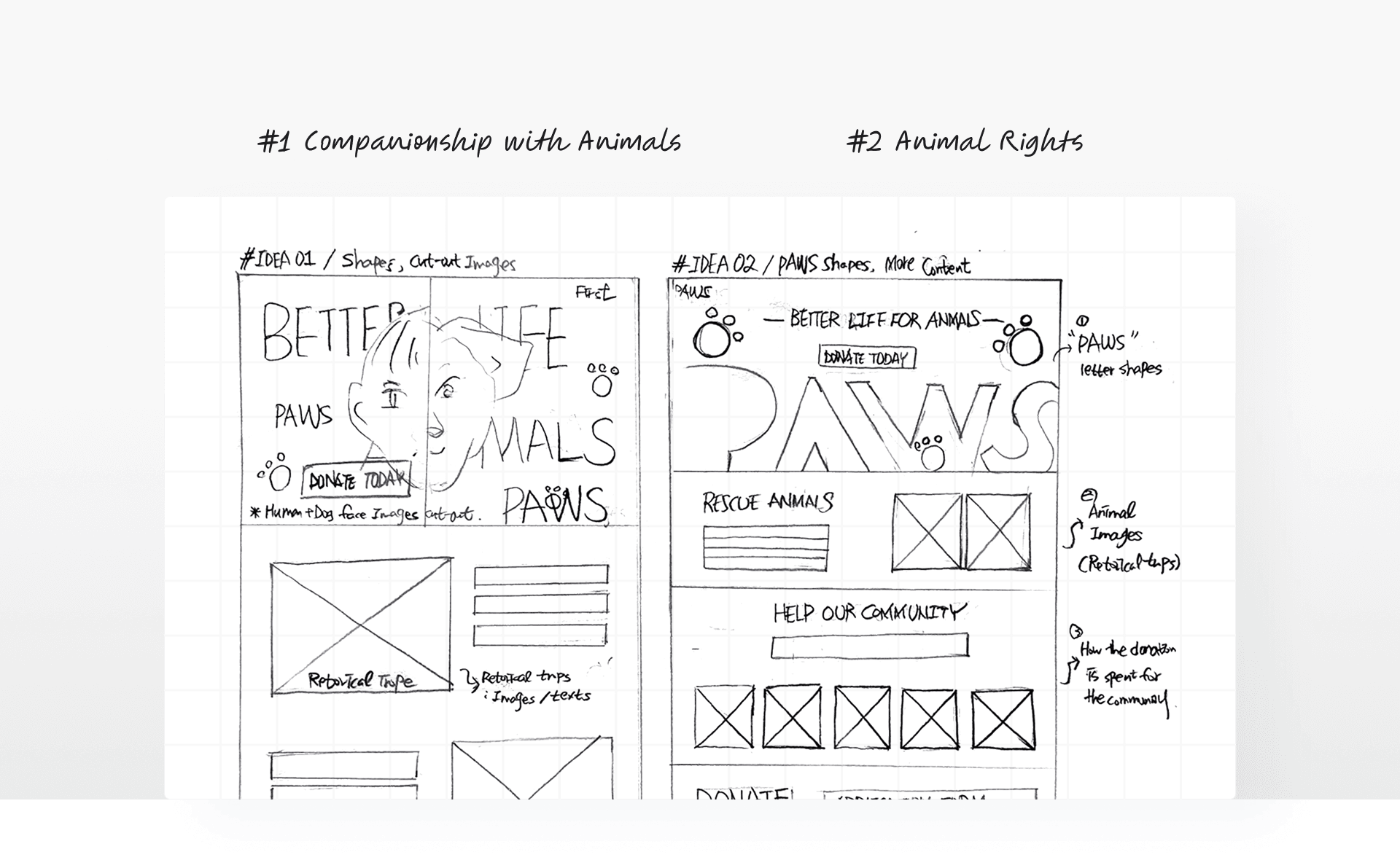
I then came up with rough sketches with two concepts.
I started by mapping out themes like abandonment, shelter, donation, and hope. Then I sketched simple visuals like paws, food bowls, broken leashes, animals in cage, and dogs raising their paws. I chose these because they were easy to understand and showed need in a gentle, emotional way.
#1 Companionship with Animals
Focused on the bond between people and animals. I used side-by-side portraits to show warmth and comfort. The goal was to make the viewer feel emotionally close and connected.
#2 Animal Rights
Animals deserve care and respect. I shaped the word PAWS to look like a paw and images like raised paws to suggest a quiet call for help. It was meant to feel more serious and urgent.
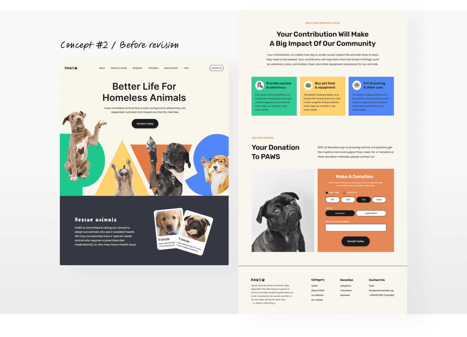
After careful consideration, Concept #2 selected.
This version was better aligned with PAWS’ advocacy tone and created more room to integrate rhetorical visual ideas.
Design Critique
Seeing the concept through six thinking hats
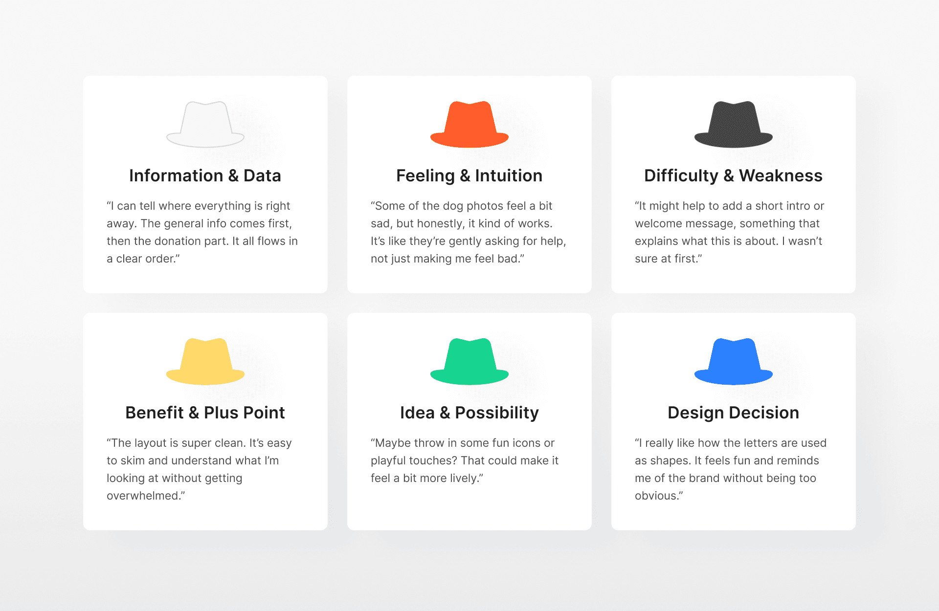
To test out the concept, I shared the draft with three peers and guided the discussion using this method. It helped me explore the design from different angles, such as what felt emotionally right, what was missing, and how imagery, icon choices, and layout could be improved.
Design Iteration
How did the design improved based on the feedback?
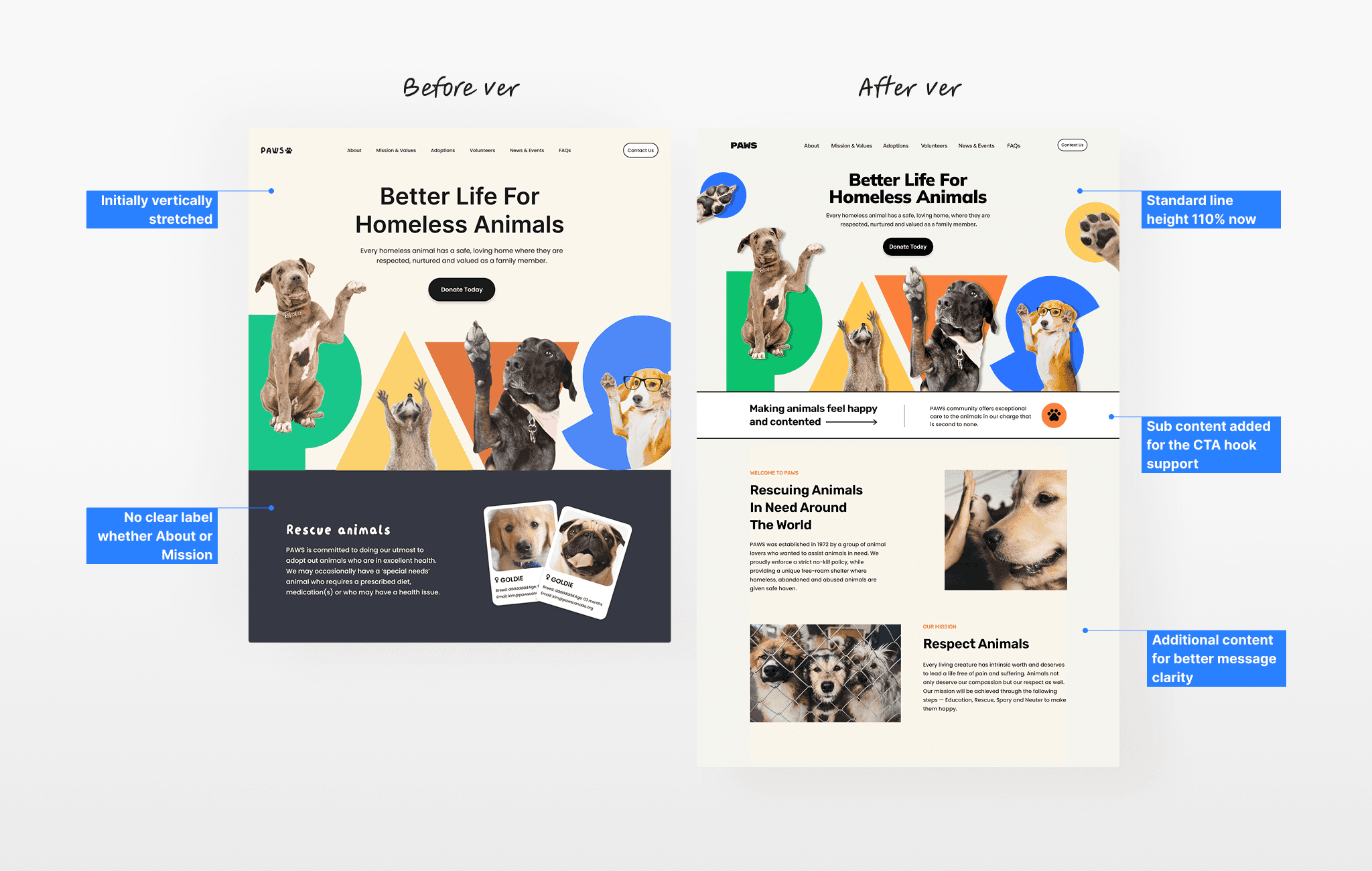
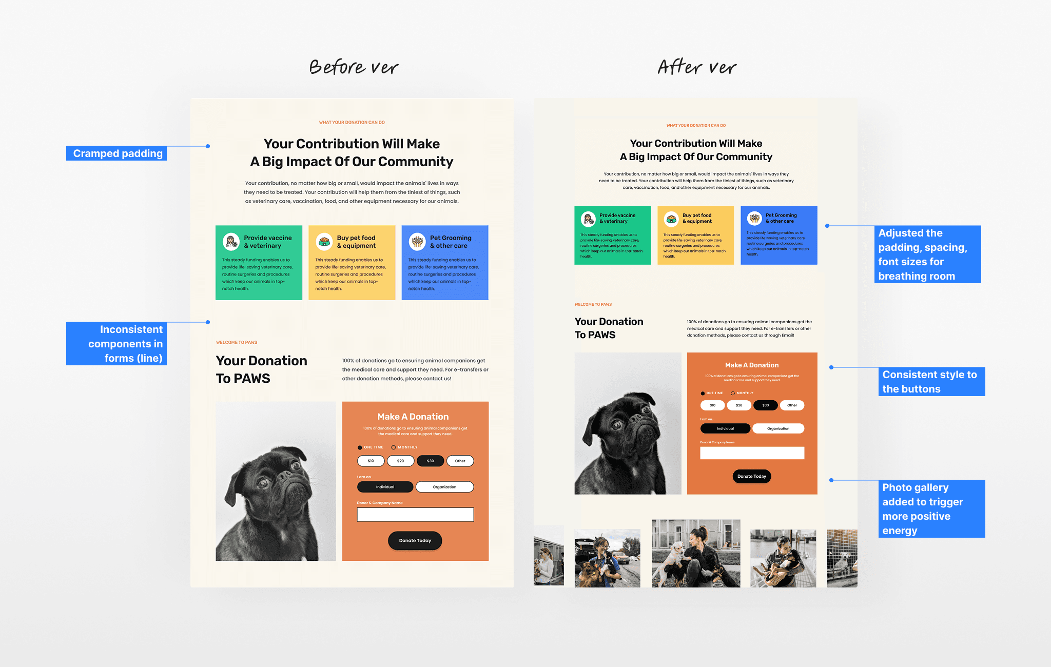
After considering the feedback, I focused on changes that had the most impact with minimal effort. Since this was a one-week sprint, I aimed to clarify the message, build emotion, and improve scannability overall.
Hero section
Why It Matters + Donation form section
Final Design
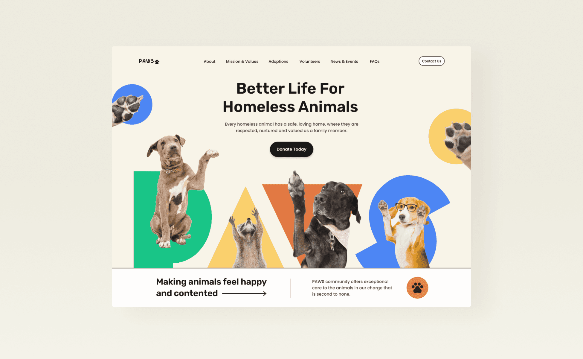
Playful PAWS page through visual rhetoric
It aims to trigger emotional engagement and support for the campaign through a visually persuasive redesign.
Signing Off
What I learned
I realized how much the right photo can shape the message. It helped make the design more emotional, clear, and persuasive without relying on too much text. Additionally, I learned how to filter feedback. Instead of trying to apply everything, I focused on what aligned with the goal. That made the design process more manageable.


