Microsoft Inclusive Design
One Feature for Many
Assistive UX
[2024]
Overview
While exploring how people read news digitally as my research project, I focused on the CBC News app to understand why some still struggle despite built-in accessibility features.
This led me to learn about mismatch and Microsoft's inclusive design, and I designed a feature that could help a wider range of readers.
My Role
Research, Conceptualization, User Interview, Prototyping, User Testing, Interaction Design
Duration
7 Weeks
Prototype
Introduction
Does digital reading feel the same for everyone?
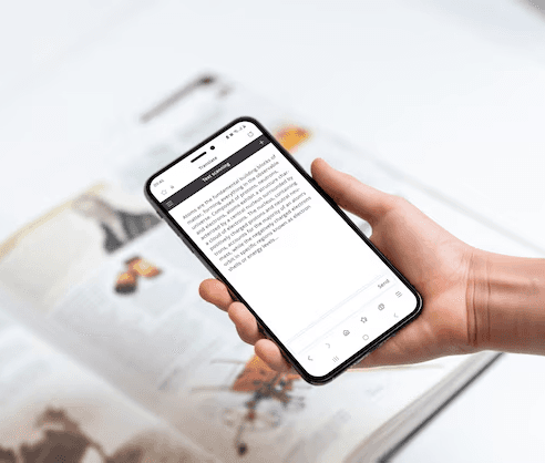
I love reading books on my phone. I can scroll anywhere, pick up where I left off, and carry dozens of articles in my pocket. But this isn’t the case for everyone. Some people find it exhausting, even when using the same apps and devices. So I wanted to dig into the why.
The Problem
Looking at the CBC News app. At first, it seems solid.
CBC News is actually my go-to. It already offers font options, light/dark mode, and good contrast. On the surface, it checked the boxes for accessibility. But the more I thought about it, the more I realized those basics don’t always translate into an inclusive reading experience.
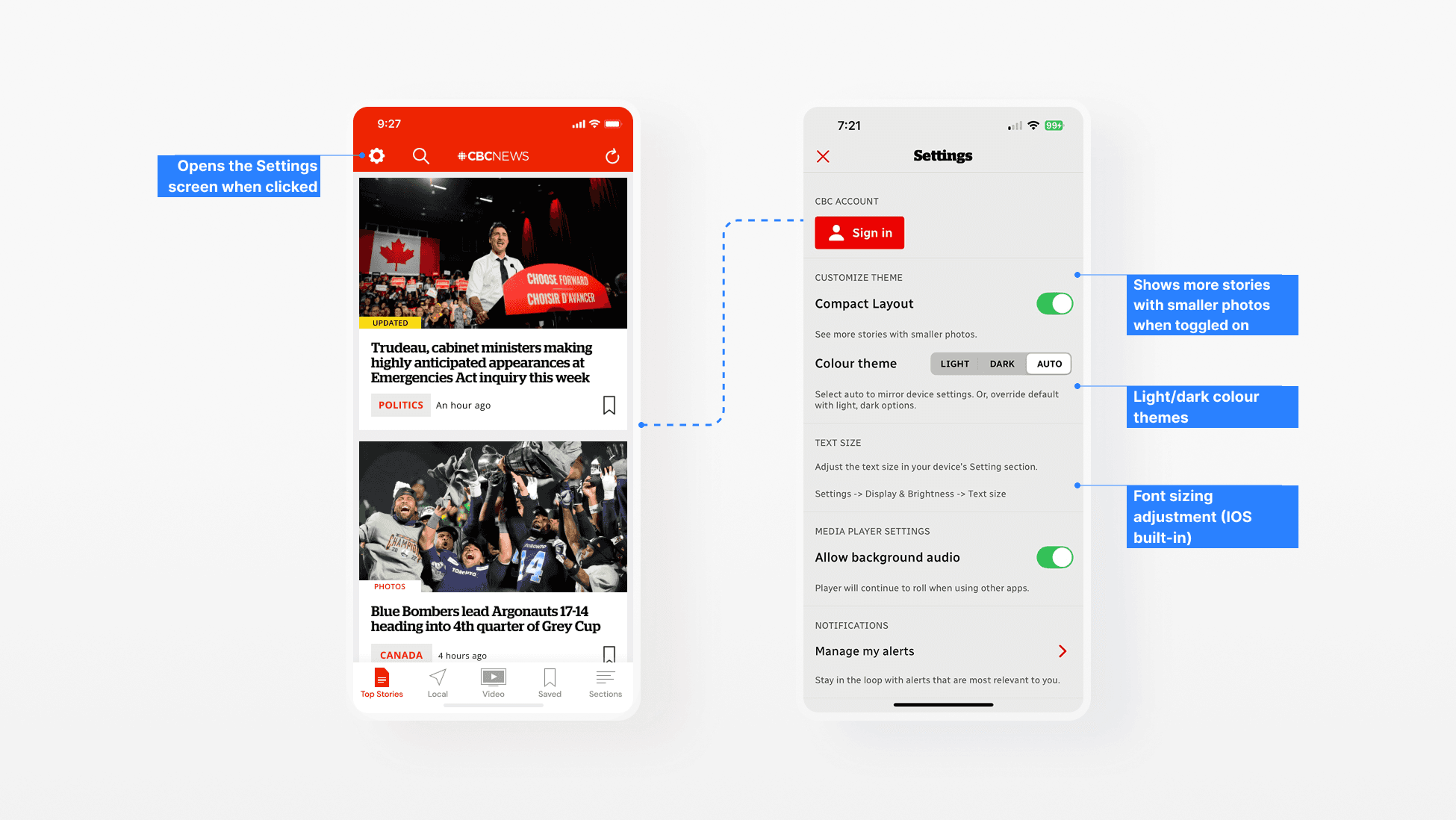
But those settings still aren’t enough.
If the essential features are in place, why do some CBC News readers still struggle? A mismatch happens when the experience does not fit someone’s abilities, context, or needs. It can quietly stop people from engaging, even when accessibility standards are met.
Secondary Research
Who experiences this mismatch? Dyslexic users.
Through review comments, support articles, and accessibility discussions, I noticed one group that came up repeatedly: dyslexic readers. Many were relying on external tools just to read a single article.
Short-term memory
Reading long passages can be challenging because it’s harder to retain information.
Color contrast
A coloured overlay can make reading more comfortable and reduce visual strain.
Different Text Perception
Words may appear scrambled, inverted, or unclear, making it harder to process content.
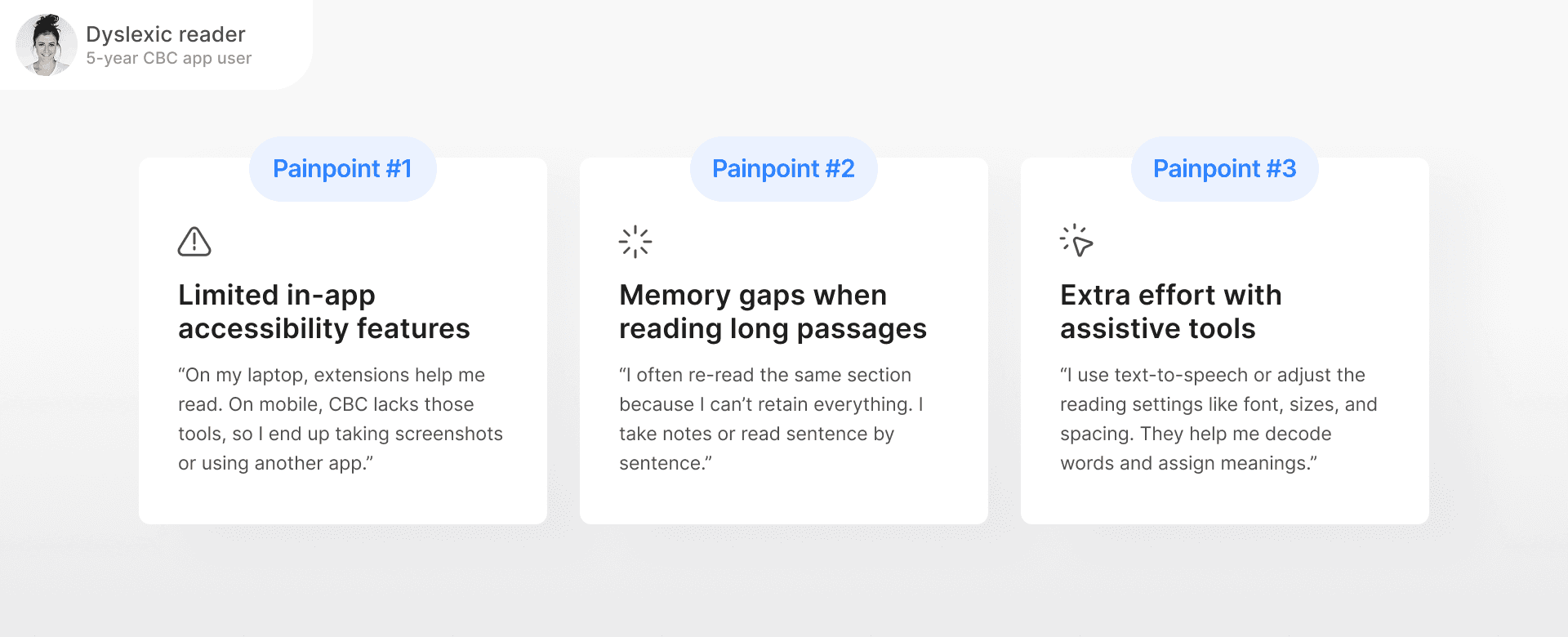
Talking to Users
First-hand story from a CBC News user with dyslexia
I spoke with a CBC News app user diagnosed with dyslexia in middle school. She’s used the app for over five years but still struggles to read long articles on mobile without extra help.
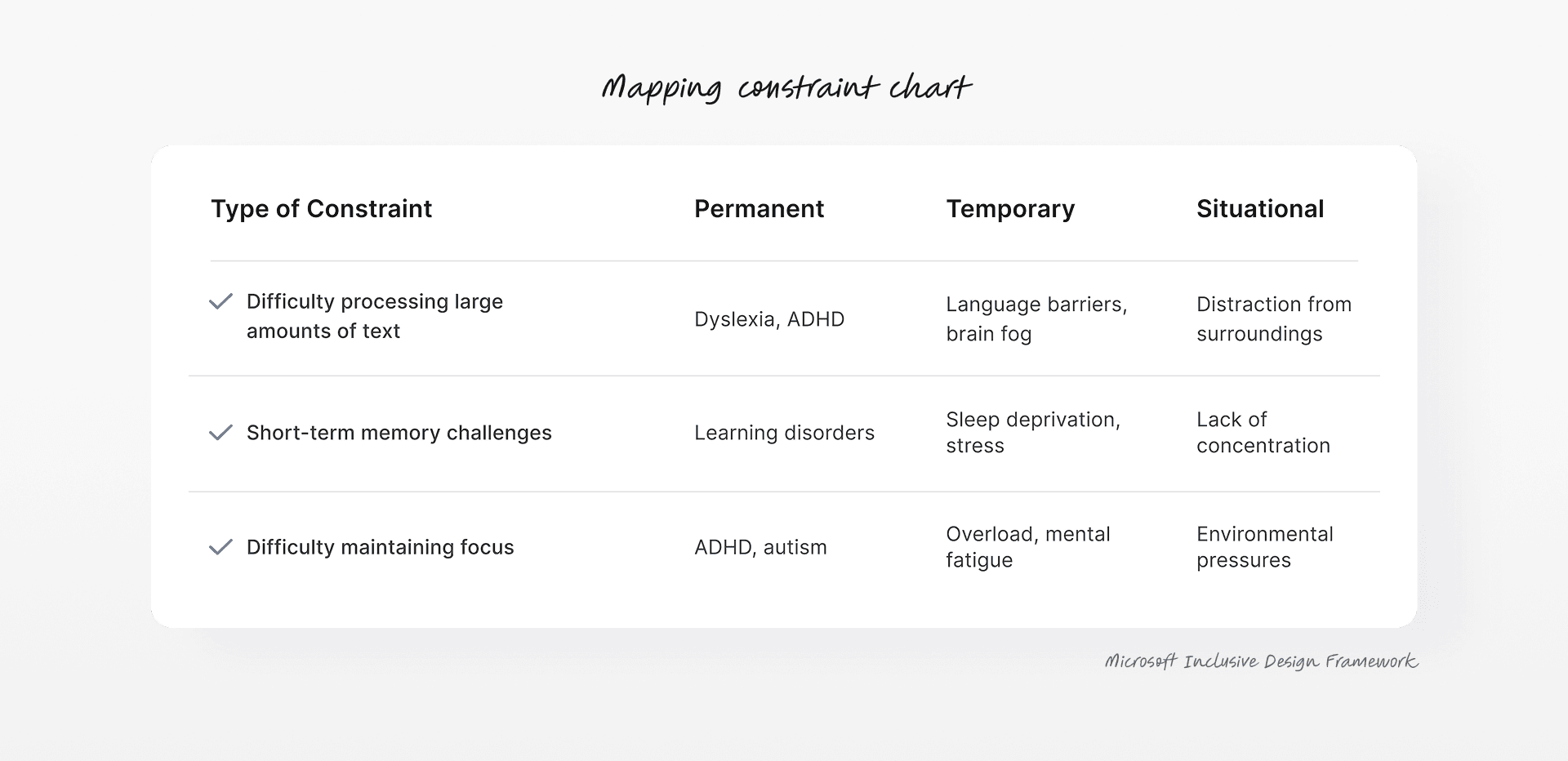
Mapping Constraints
But, those challenges weren’t unique to dyslexia.
Her experience showed me these challenges were not just about one condition. Trouble focusing, remembering, or navigating dense content can happen in many situations. I used Microsoft’s Inclusive Design framework to map out different types of mismatch.
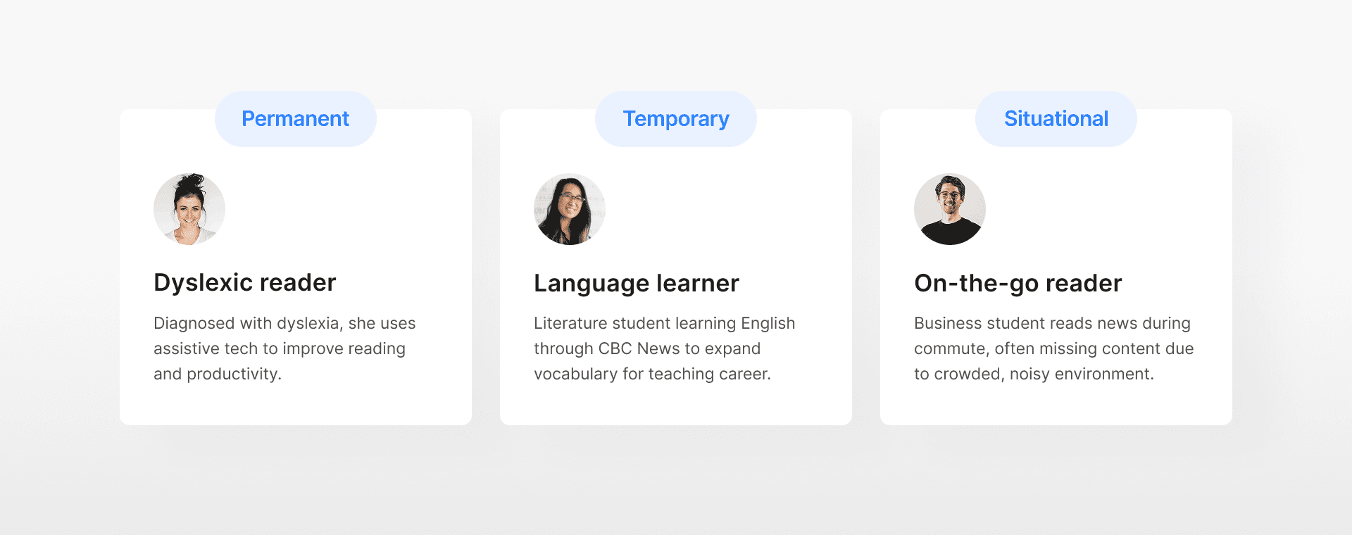
Persona Spectrum
From dyslexia to a range of user groups
Starting with the dyslexic reader, I expanded the focus to two more user groups. All three face the same challenge on the CBC News app above.
Design Challenge
How might we reduce memory and focus barriers for dyslexic readers, while also supporting diverse user needs?
I aimed to address different barriers with a single solution that adapts to varied user contexts.
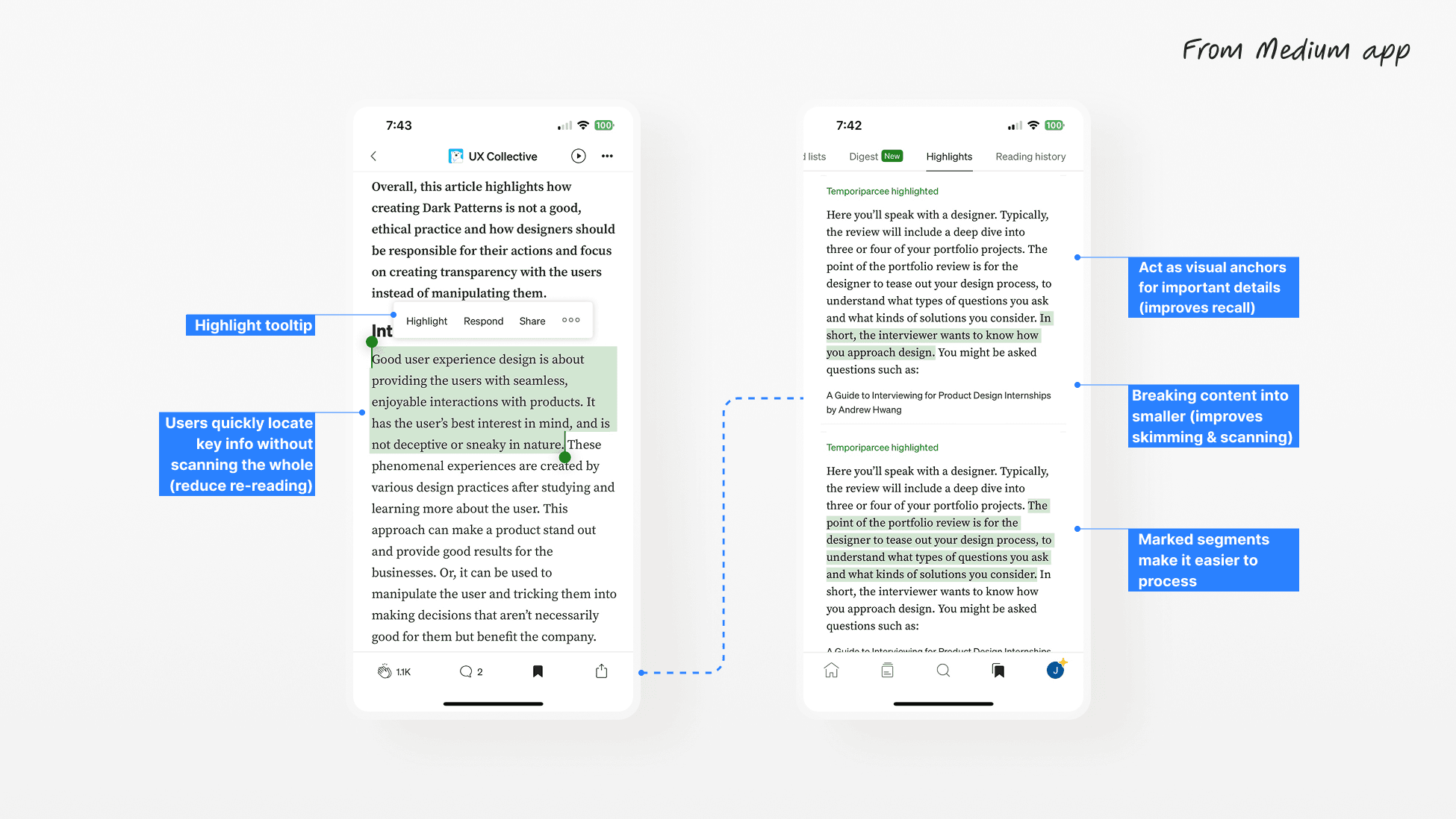
Competitive Research
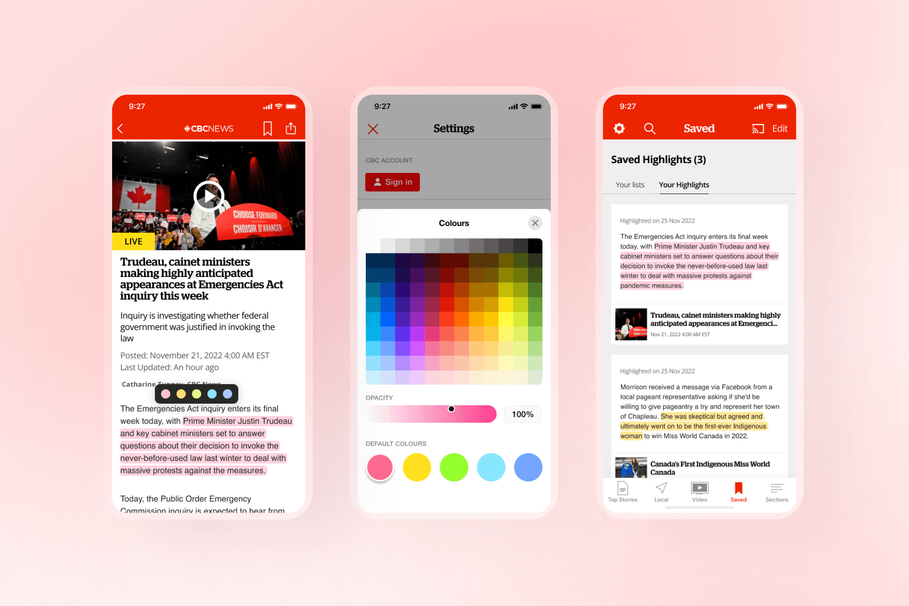
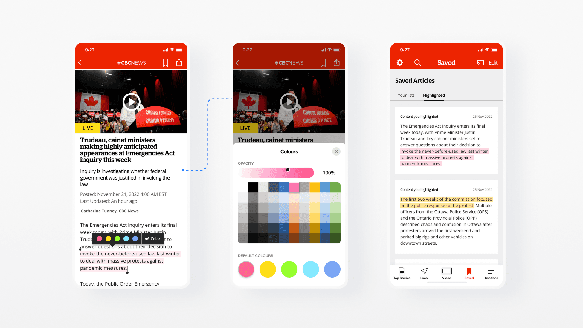
Proposing a highlight feature to support memory + focus
From the interview, the user often used highlights to stay focused and recall what she had read. This led me to explore how other reading apps handle highlighting. Many offered colour choices, a place to save highlights, and simple ways to return to key parts.
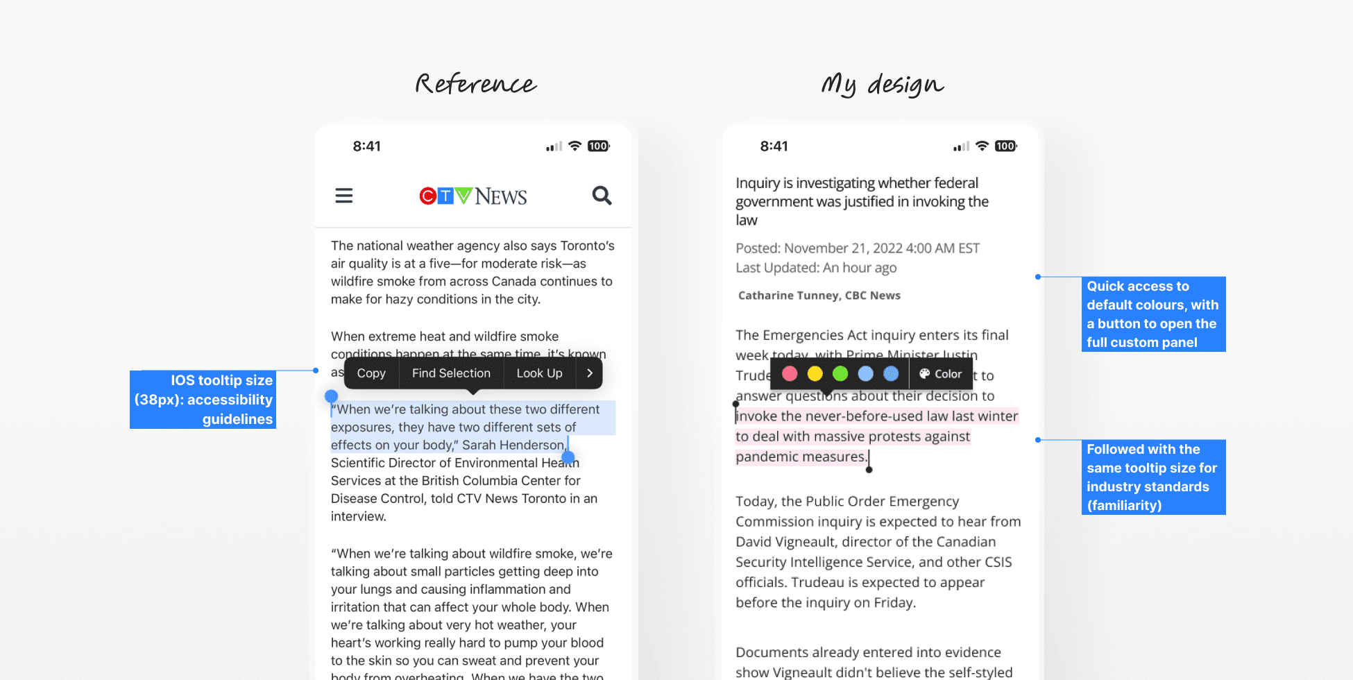
Design Exploration for Main Flow
Designing with accessibility in mind
Before prototyping, I explored highlighting and colour picker UIs from the current market, as they reflect industry standards and provide strong references for accessible interaction patterns. I then integrated them into the CBC News app.
Usability Testing
Testing the initial prototype with three user groups
Since the design was no longer just for dyslexic users, I tested this prototype with two more people, a serious English learner and a regular news reader on the bus.
Issue #1
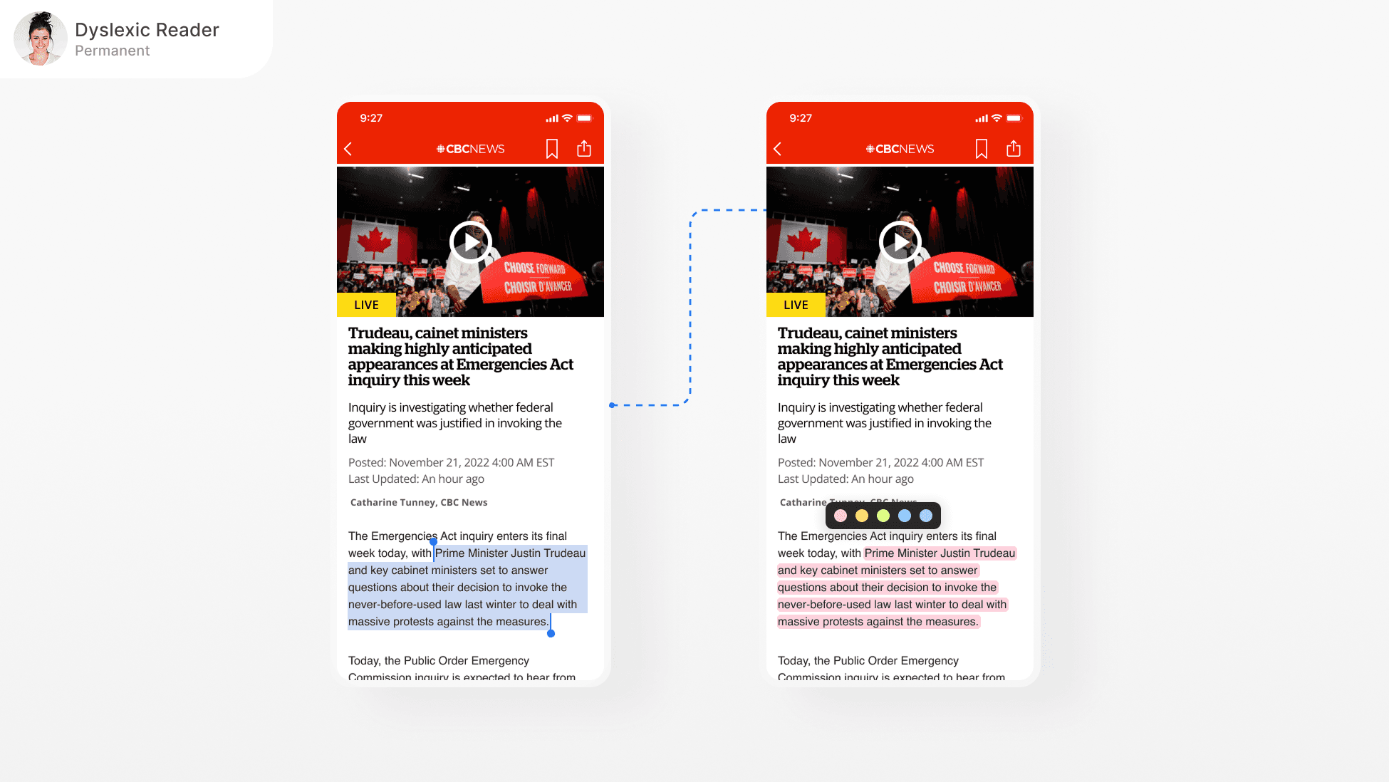
The colour custom panel familiar and effective, but the users often tapped the “Colour” button by mistake.
Issue #2
The users found the panel quite unclear showing in this same screen, feeling it disrupted their reading flow.
Issue #3
The users found it hard to tell a highlight’s context without opening each card to see its source.
Design Iteration
Iterative designs to solve the issues
After reviewing the feedback from testing, I refined the prototype to address the issues users experienced.
Highlight tooltip
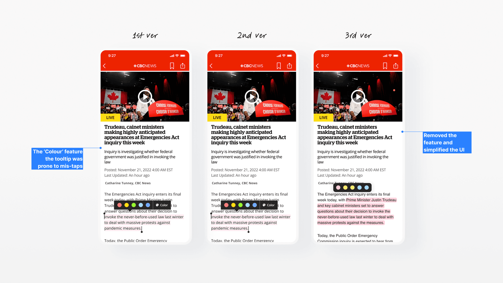
What’s revised? Removed the feature and decided to make this experience separate for better access.
Colour custom panel
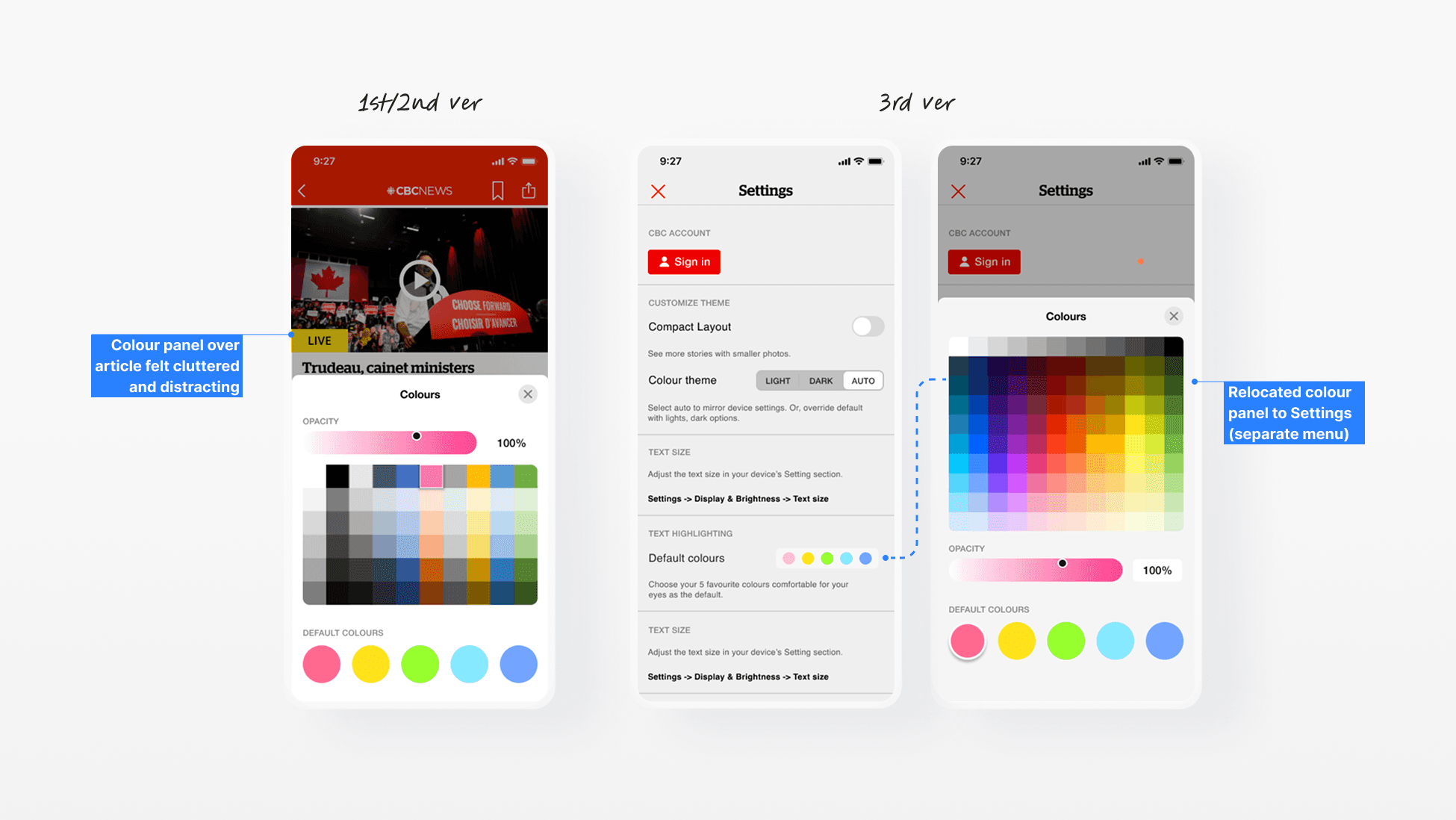
What’s revised? Relocated colour panel to Settings. It keeps the customization process separate from reading, reducing clutter and distraction.
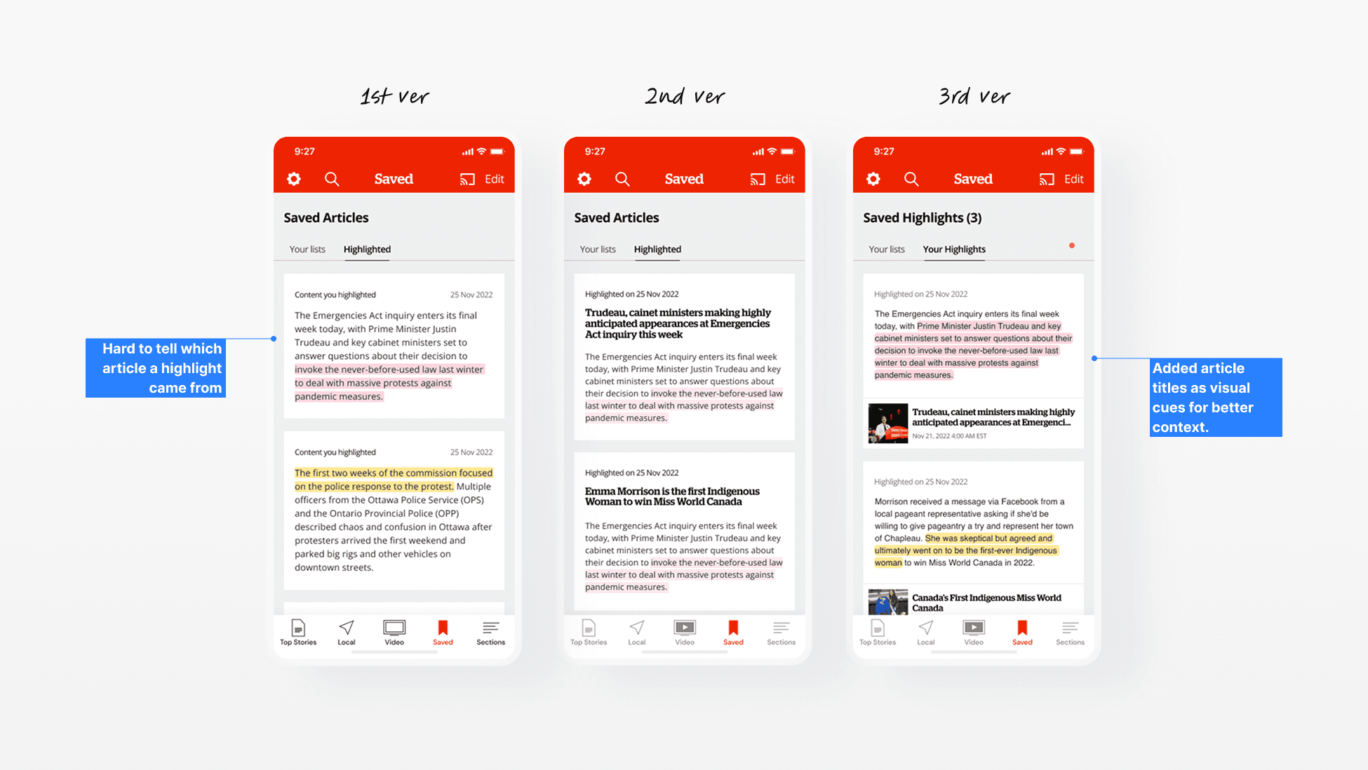
What’s revised? Added article titles as visual cues for better context. This helps users quickly recall the source and purpose of their notes without opening each card.
The Solution
One built-in highlight feature for many uses
A simple highlight tool that adapts to the way people actually read.
Outcome
I ran a final round of testing with the three user groups using the revised prototype. The goal was to see if the updated design worked smoothly for their different needs. Here’s what it turned out!
3/3
Successful task completion
All participants (different user groups) was able to highlight text, change colours, and retrieve it from Saved without errors.
~12s
Average highlight-to-retrieval time
Average time from marking a sentence to finding it in Saved dropped to around 12 seconds.
Signing Off
What I learned
I learned how small interaction changes can make a big difference for different types of users. I would like to study deeper how inclusive design can be built into everyday product decisions so accessibility becomes a natural part of my design process rather than an afterthought.