End-to-End UX & UI
B2B Website
For First Visitors
[2025]
My Internship Story
While working on my main project, the developer team began migrating the company website to a new platform. During this transition, the VP of Marketing saw an opportunity to improve the site, and I redesigned the website’s first touchpoint as a solo digital designer.
Outcome
First-time clarity by 85% and the design system adoption across 15+ pages.
My Role
Research, IA, Conceptualization, Visual Design, Prototyping, User Testing
Team
Design Manager, Graphic Designer, Content Specialist
Stakeholder
VP of Marketing
Duration
2 Months
Introduction
Imagine realizing what the company offers only after scrolling far..
That was the reality for many first-time visitors on Advantage’s site. Instead of quickly understanding our value, they were leaving confused. Here’s what I discovered during my research.
67%
Visitors bounced off the homepage without exploring further (industry average: 45%)
8.4 sec
Visitors spent only a few seconds on the homepage before deciding to leave.
62%
Visitors were confused about the company’s offerings until they scrolled down the page.
But, what does Advantage Group do?
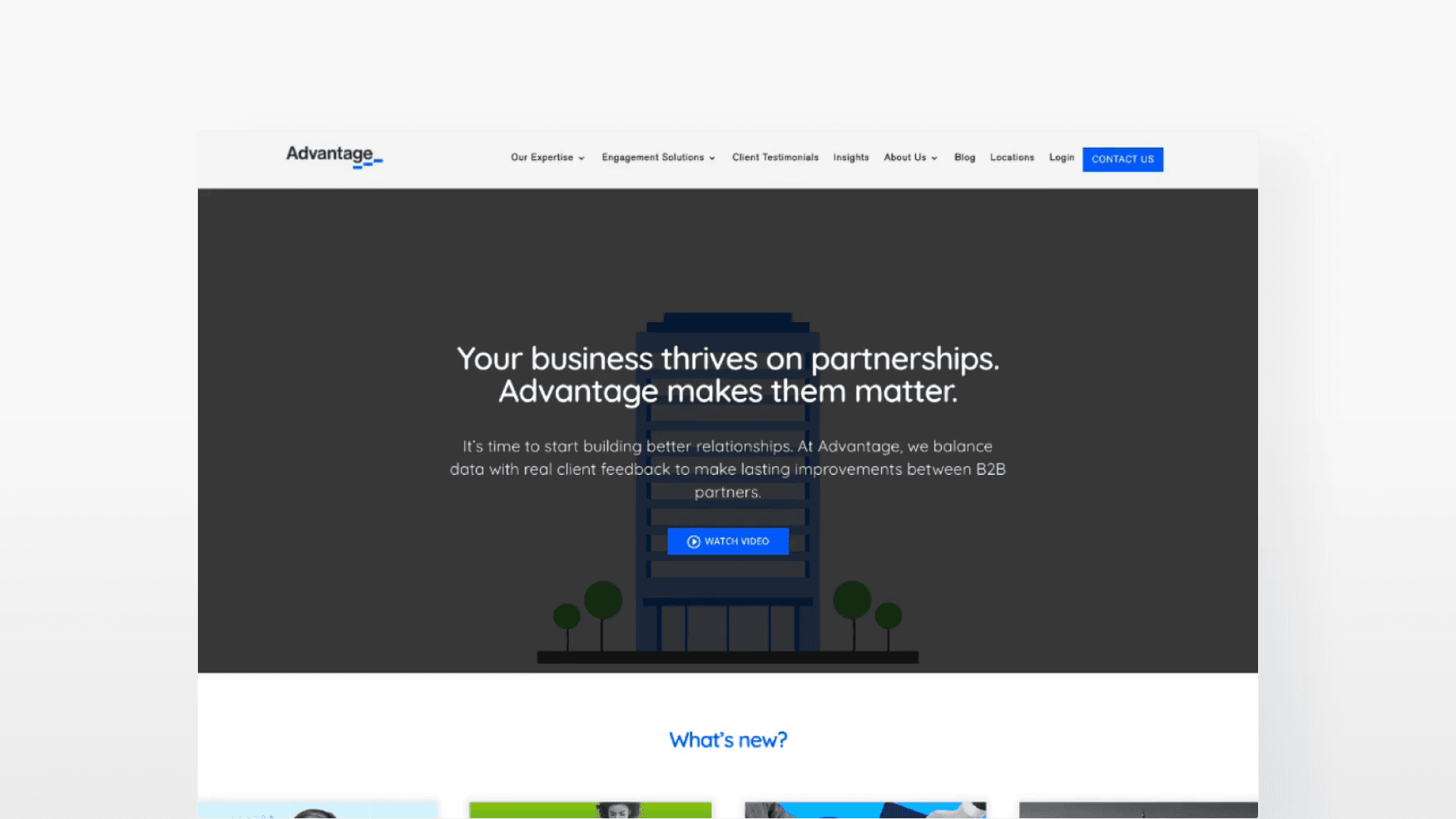
Advantage is a B2B company that helps suppliers and retailers build stronger partnerships through performance tool. Surprisingly, their website was last rebranded in 2019 and needed a redesign to better communicate their value.
[Redesign started from here - Old version]
Problem Breakdown
Why the page didn’t work for first-timers?
Through research and testing, I uncovered three key gaps that were preventing them from understanding the company’s value.
Update delivery over value (IA)
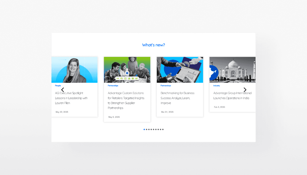
Roughly 40% of visitors were first-timers, yet the homepage led with company updates instead of product offerings.
Visual clutter blocks CTAs
Inconsistent spacing, competing elements, and weak hierarchy made the page hard to scan and find the buttons.
Accessibility & Consistency Gaps
Unstandardized buttons, typography, and colors caused readability issues and broke visual hierarchy.
The users wanted to spot key info at a glance, but the clarity came too late.
I conducted guerrilla testing with 5 participants and observed how they naturally explored the page in the first 10 seconds (first-impression window). Let’s see how they interacted with the site below.
3/5
Of participants first skimmed top-to-bottom, hoping to see a clear summary of the product.
4/5
Paused on “What’s New” section drawn by its visual, but it was just news update.
5/5
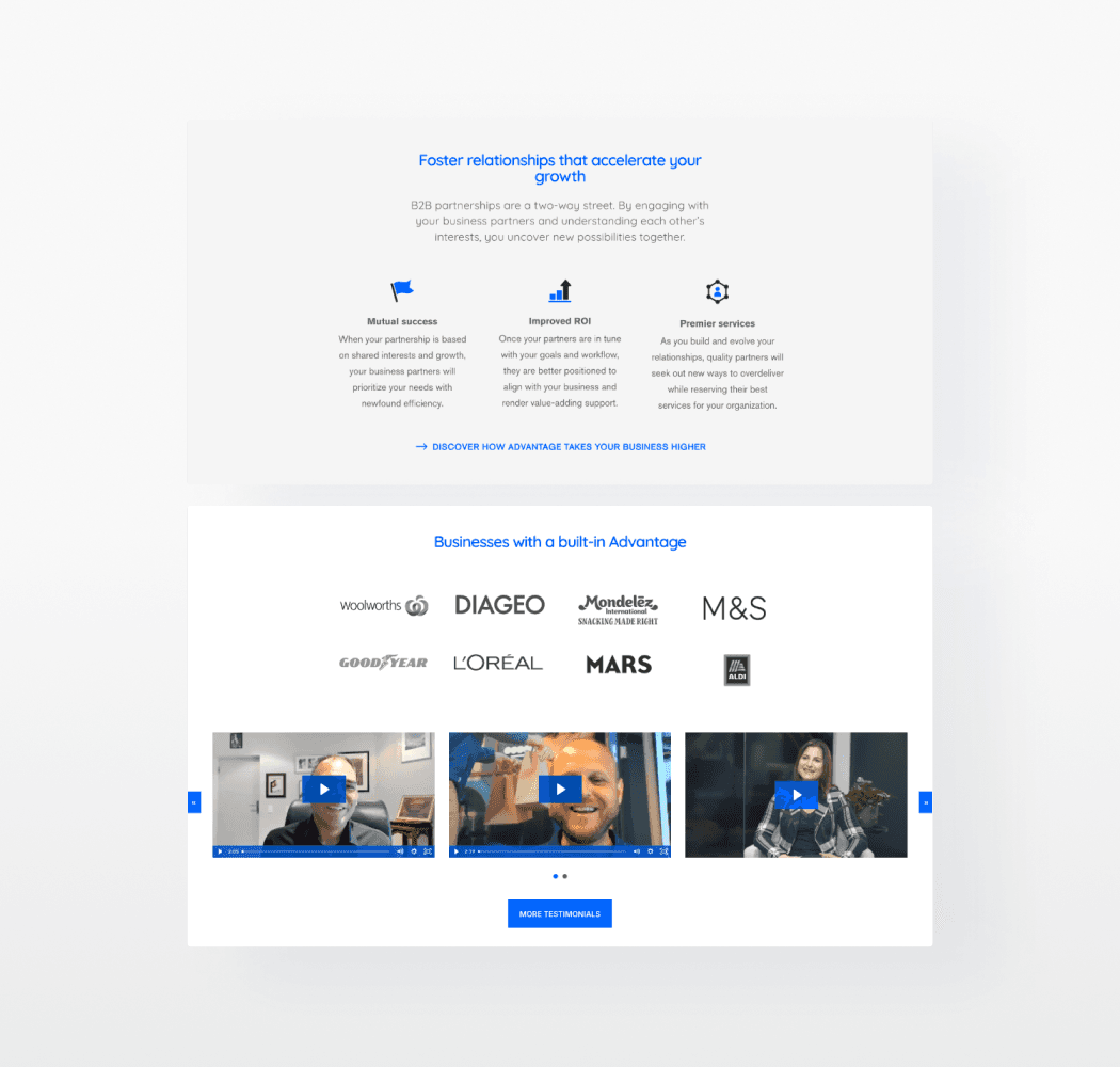
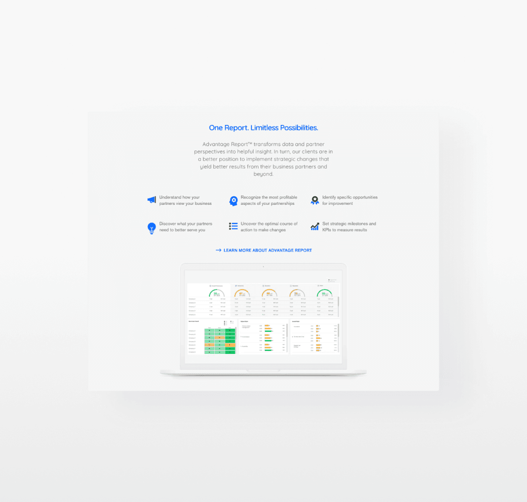
Overlooked the offering initially, as it was buried far down on the page.
Competitive Research
How others hook and convert first-timers?
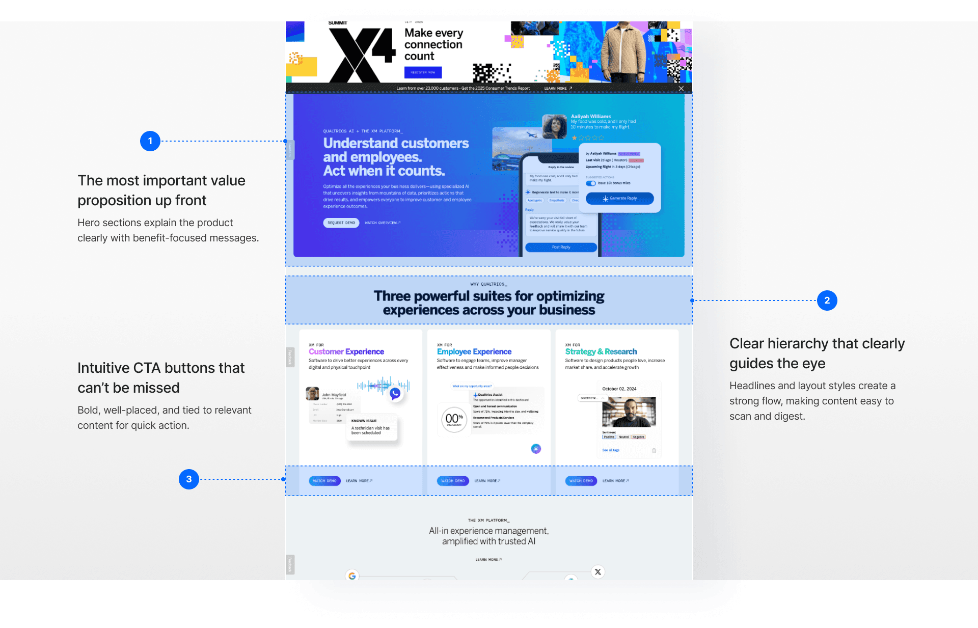
I looked at industry leaders like Microsoft Dynamics, Qualtrics, and SurveyMonkey. Their landing experiences weren’t just visually appealing but strategically designed to introduce services and highlight value.
Information Restructure
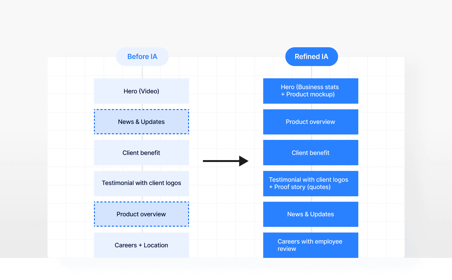
Started by reorganizing the content flow strategically
From the guerrilla testing, I found that they wanted to see a clear explanation of what the company does, how it can help them, then credible proof that it works.
Design Foundation
Roadblock: No structure, no system. So I built one.
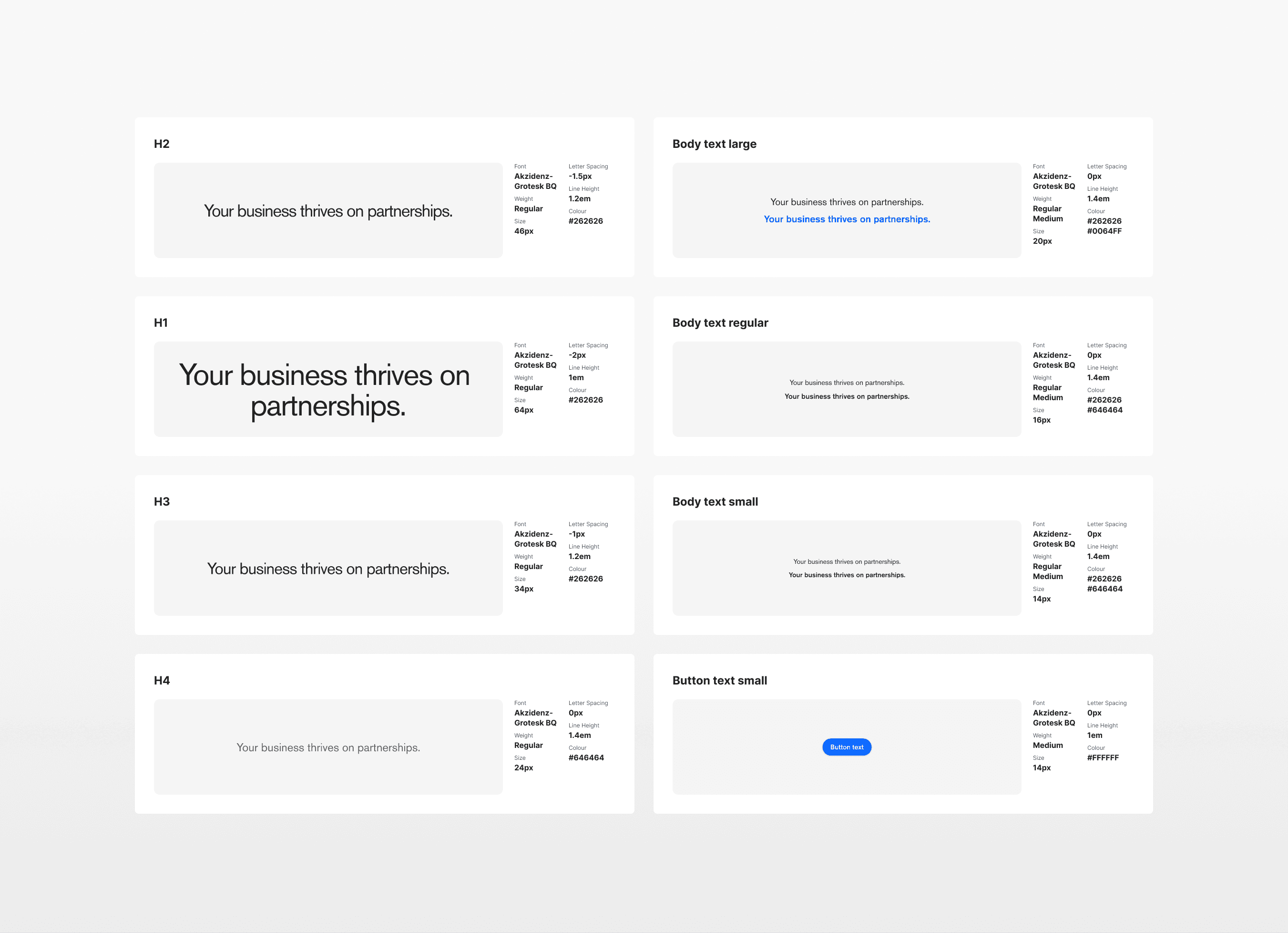
Before design exploration, I needed to lay down a solid foundation. I first revisited all the live pages to analyze the current look and feel. Then I gathered scattered, unofficial design elements and standardized them into a consistent visual system.
[Guideline document from our senior designer]
Design Challenge
How might we make the company offering clear within the first 10 seconds while modernizing the brand’s look and feel?
A/B Testing + Feedback
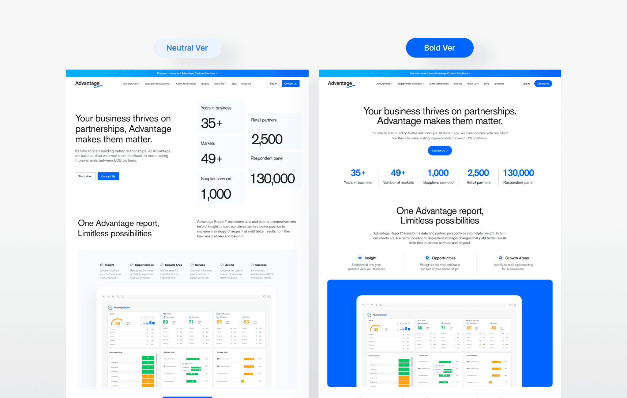
Neutral vs Bold? Which suits the brand best?
I led A/B testing with the team, sharing 2 concepts to weigh the difference for clarity and brand expression. Across 10+ check-ins, I gathered tons of internal feedback to refine the direction. With tight timelines, I used a prioritization matrix to focus on high-impact feedback and keep the design moving.
Key Refinement
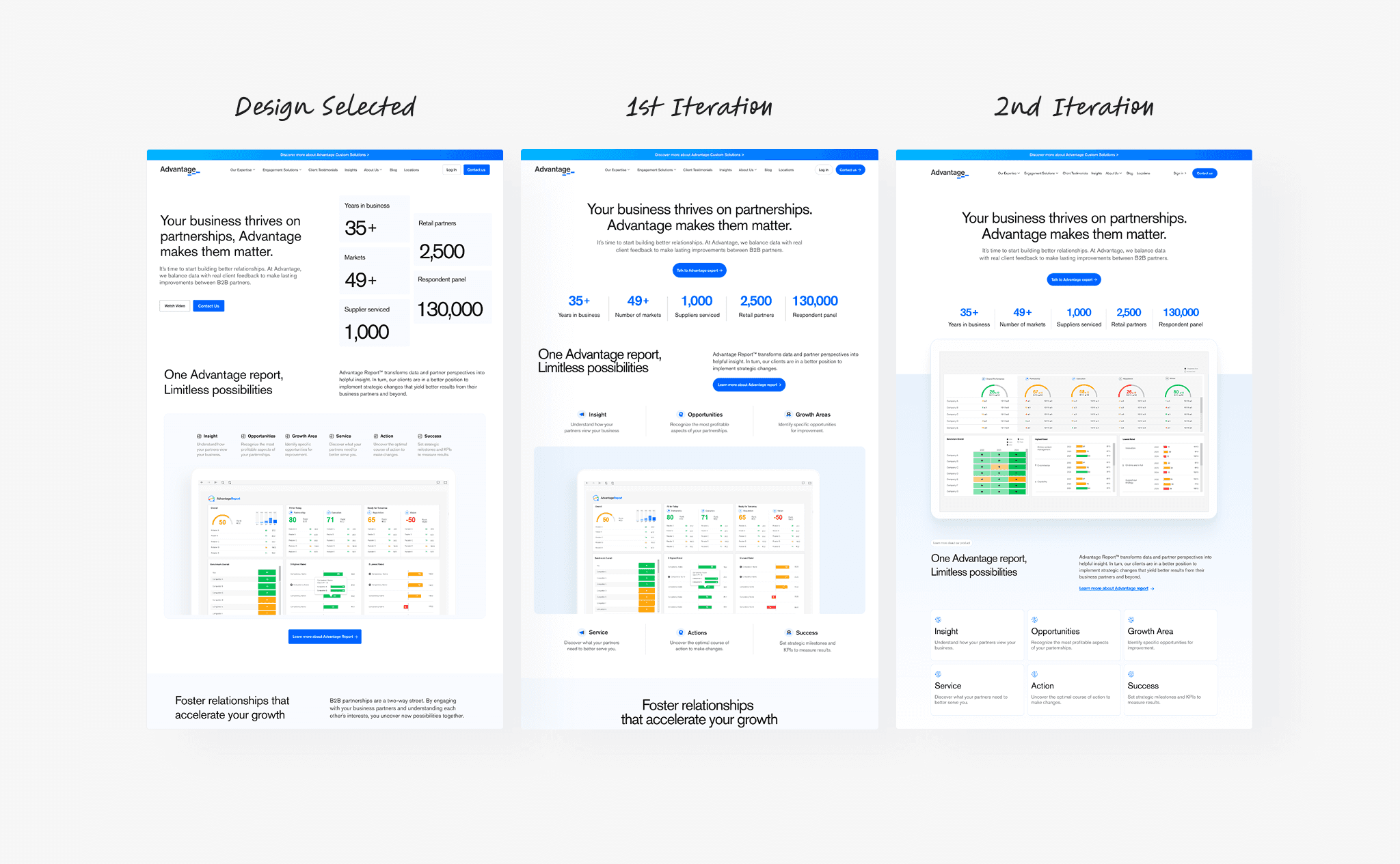
Iteration 1: Finding the right product focus
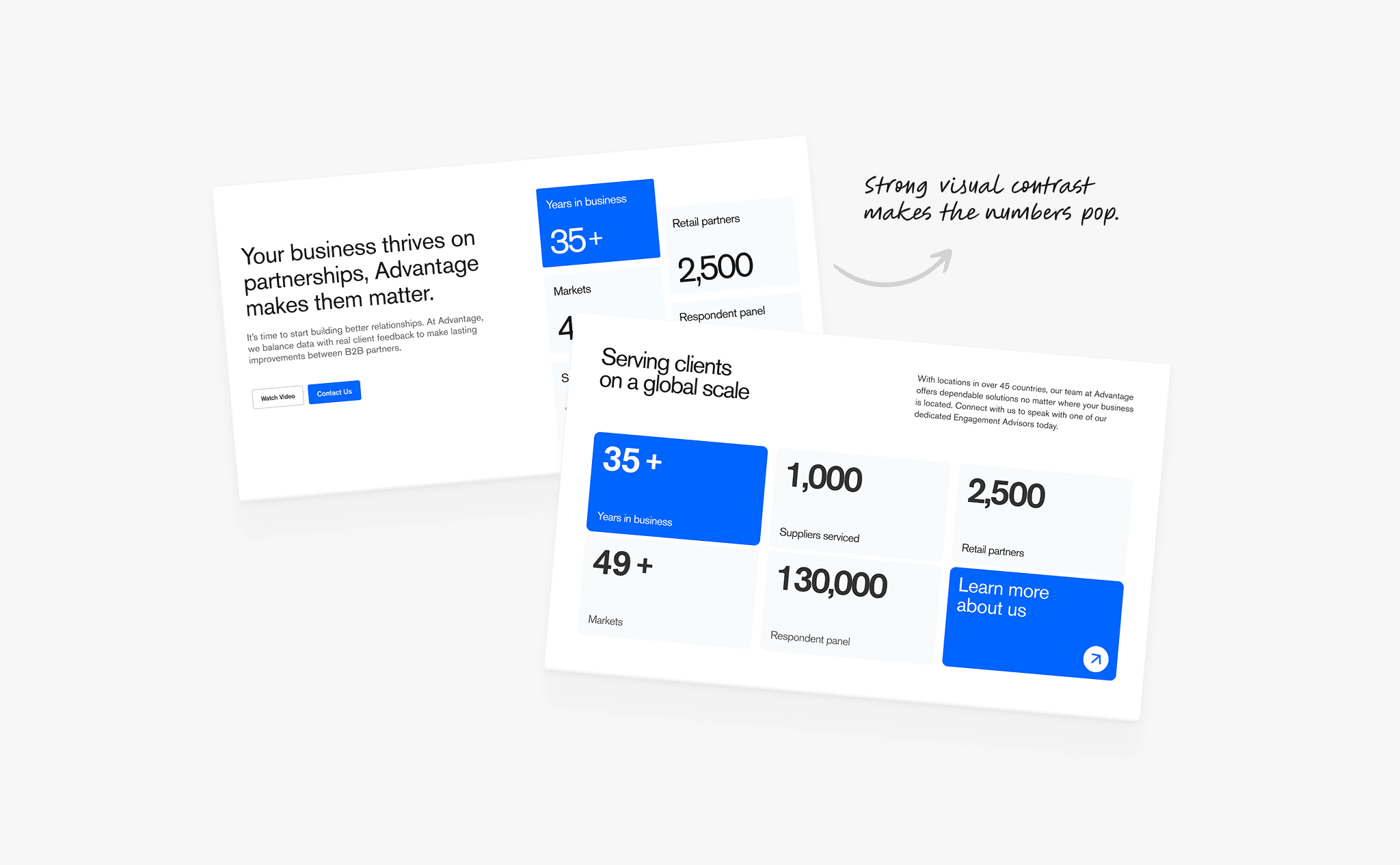
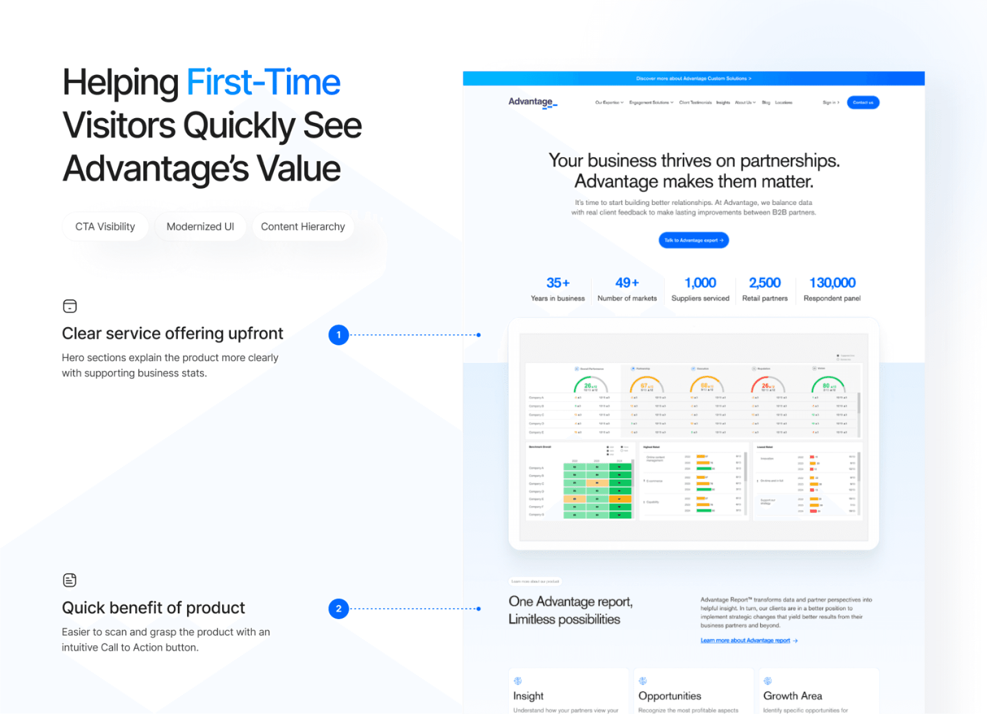
The product section moved higher for quicker access to core offerings. Stats were also streamlined horizontally, and CTAs repositioned near key decision points.
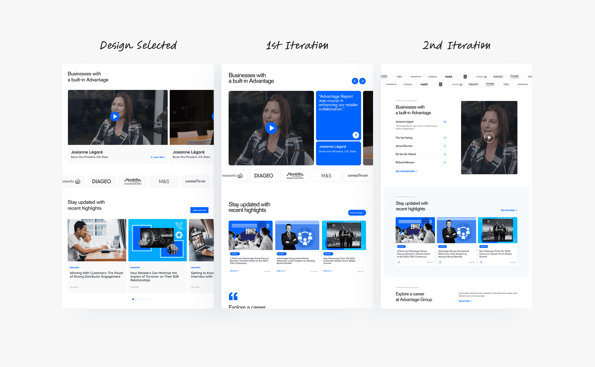
Iteration 2: Streamlining proof for faster trust
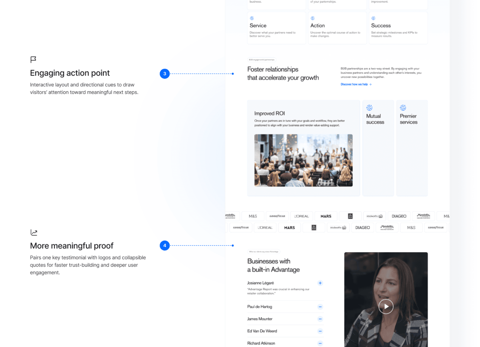
The testimonial section shifted from multiple videos to one focused story with supporting quotes. A collapsible layout was introduced to handle long copy cleanly without causing layout changes.
Designing for Flexibility
Supporting smooth content adjustments
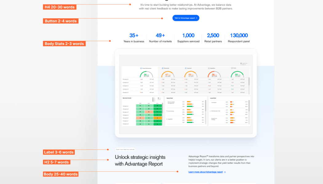
As the copy was still in progress, I also helped to accommodate content changes smoothly for the content specialist. I defined estimated max content for each section.
Company’s first step toward accessibility
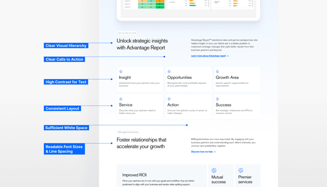
Before handoff, I ran an accessibility check to ensure the final design felt usable for everyone. It showed strong wins in hierarchy, spacing, and scannability. I saw this as an ongoing effort that our team should push further for future updates.
Final Design
Here’s how it came together!
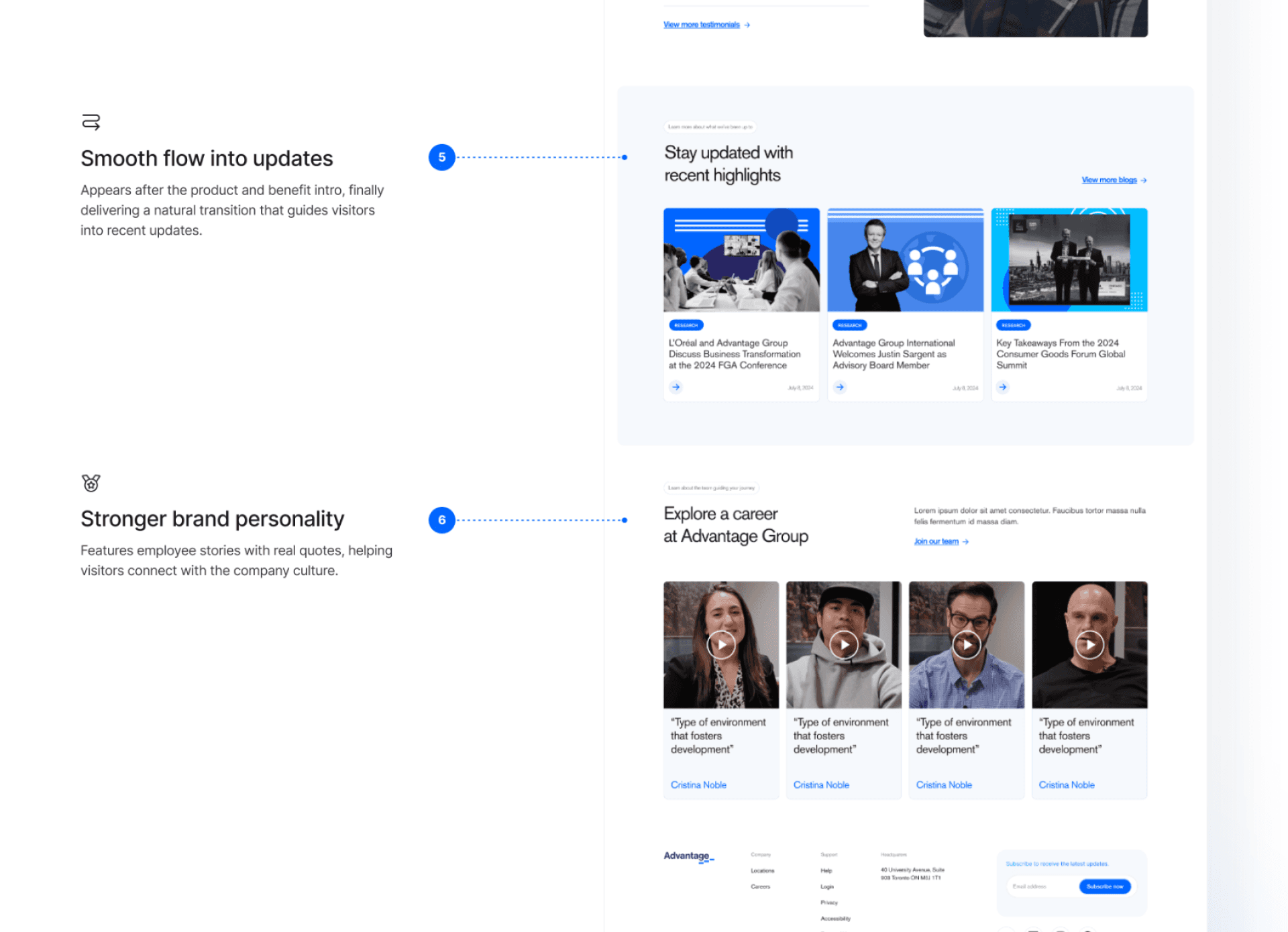
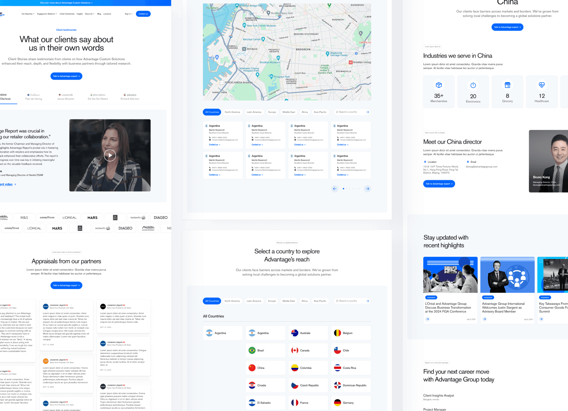
I carefully finalized design decisions based on internal and user feedback.
Impacts
While this project started as a simple landing page redesign, it became the foundation for strengthening the company’s brand. It has set the stage for consistent, scalable web experiences across the organization.
Signing Off
What I learned
This project taught me to navigate constraints, collaborate across teams, and make intentional design decisions. I realized how fresh perspectives uncover blind spots, how content and UX work hand-in-hand, and why every choice needs clear reasoning to align stakeholders.


