4-month Journey
Internal Hubs
SharePoint Tool
[2025]
Overview
Advantage is a globally distributed organization, where effective internal knowledge access and cross-department communication are key to operational efficiency.
As the sole digital designer on the marketing team, I had the opportunity to lead the creation and improvement of +8 departmental SharePoint hubs from scratch, tackling each with distinct user needs.
My Role
User Interview, Prototyping, Visual Design, SharePoint Integration
Team
Design Manager
Stakeholders
8+ leads across different departments (Marketing, Revenue, Operation, etc)
Duration
4 months (2-3 weeks each hub)
My Internship Journey
Before joining, I was in my third year of Sheridan’s Interaction Design program.
Most of my past projects were either school-based or self-initiated, so I hadn’t yet designed something that would be used across a real company. However, that changed when I joined as the only digital design intern. In my first week, I met my manager, Karl, and had to learn about how teams shared information internally through SharePoint.
But, what does Advantage Group do?
Advantage is a B2B company that helps suppliers and retailers build stronger partnerships through a performance tool.
[Advantage Dashboard Product]
My Goals
I aimed to grow the skills that I couldn’t learn in a class room!

Beyond practicing design methods, I wanted to use this experience to develop core skills that would help me work more confidently in a real team setting.
Learning how to design with real people, not just personas.
Communicating clearly, presenting ideas, and navigating feedback.
Strengthening time management and prioritization.
Impacts
Overall, The designed hubs made it easier for teams to find what they needed and stay updated. They also helped bring more consistency and engagement across the organization.
~30%
Less time spent finding what they need
Employees are now able to access tools, dashboards, and updates faster.
+40%
Increase in daily hub usage
Became a go-to space for staying informed and getting work done across teams.
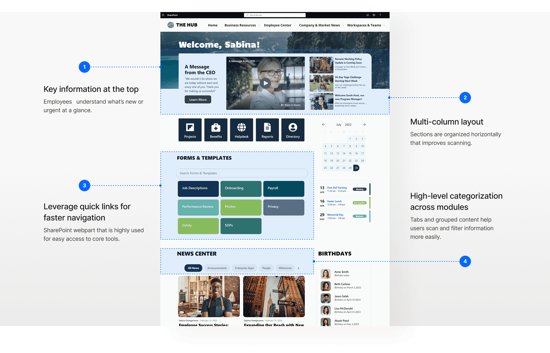
Featured Hub
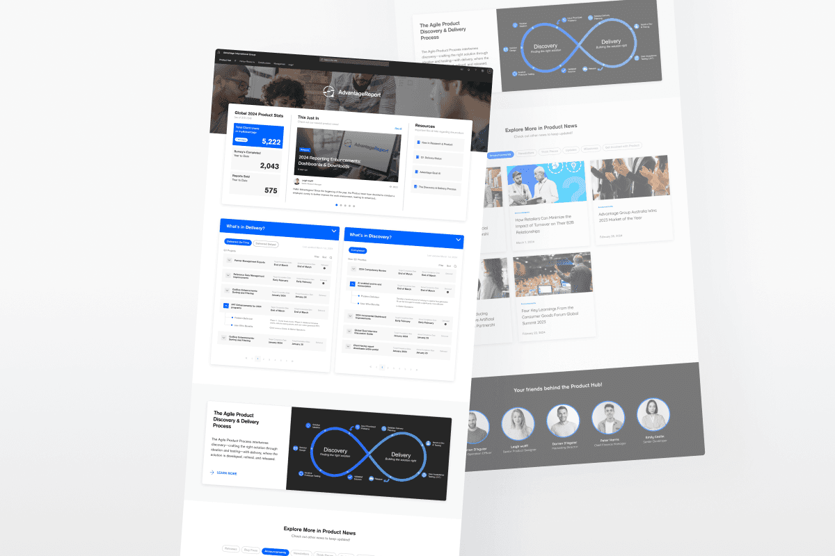
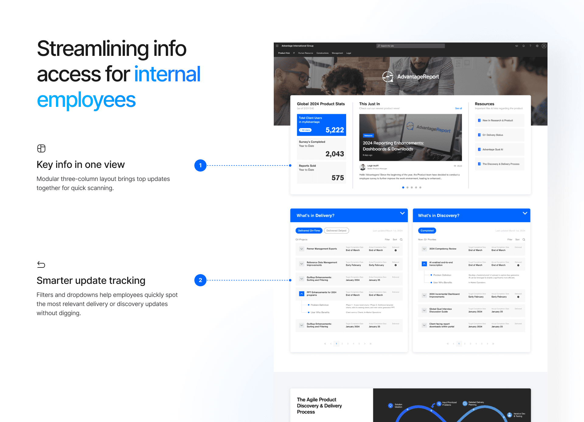
Let’s zoom into one of the hubs, the Product hub’s before ver.
Out of all the hubs, the Product Hub was the most active and widely used. Since there was already an existing version, I redesigned it.
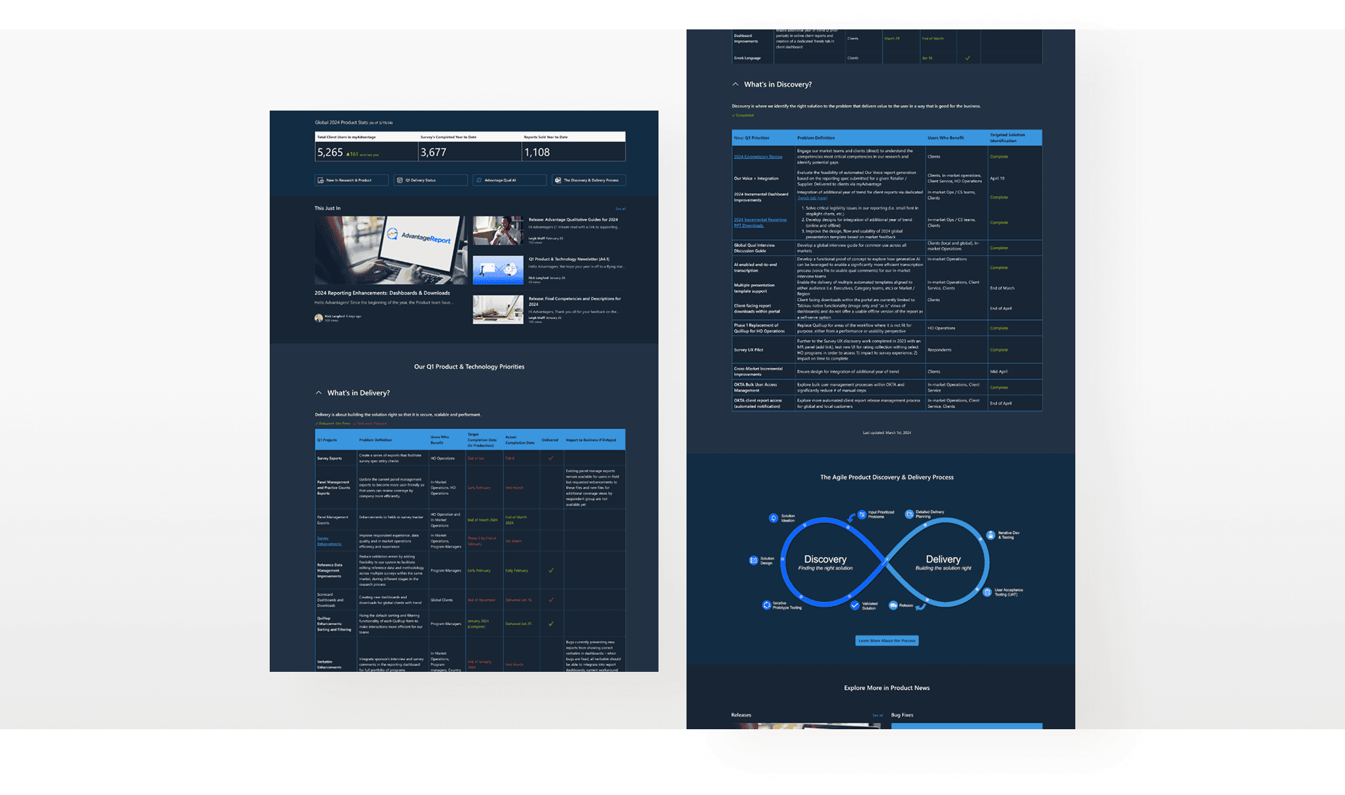
[Redesign started from here - Old version]
We set out focus area to improve the overall hub experience.
I got to walk through the hub with the Product team and see how they actually used it. It helped me understand what content mattered most and where things felt confusing. From there, we aligned on three key focus areas to guide the redesign.
Prioritize content visibility
To avoid letting newsletters and updates get lost.
Compact layout
To reduce scroll and surface everything at a glance.
Support the table
To help employees navigate complex delivery timelines with ease.
Listening to People
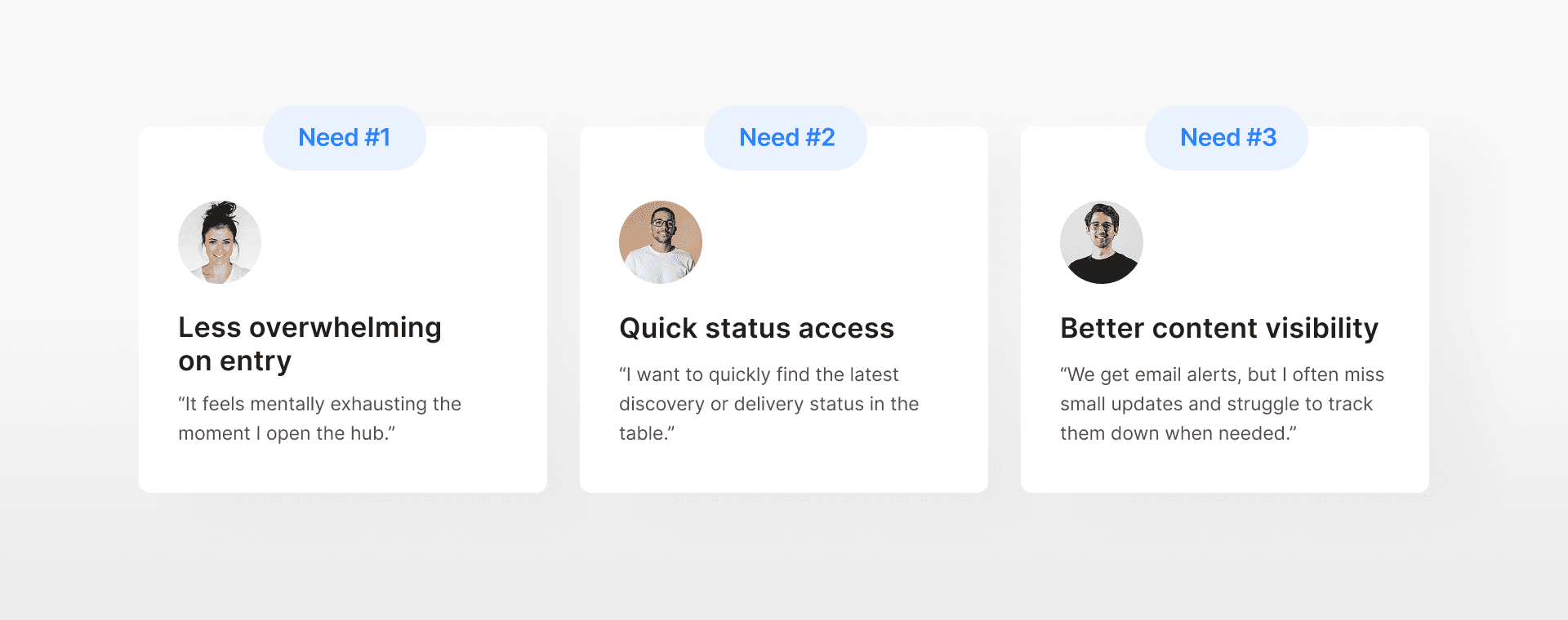
Our employees struggled to find resources within the hub.
I talked to over 10 internal team members to understand what made the current hub hard to use. Their feedback helped me spot the biggest blockers that turned into insights.
Problem Breakdown
What slowed them down in the old hub?
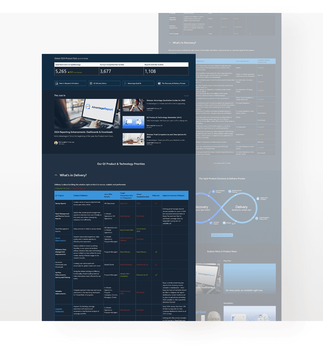
Overloaded layout felt fatigue
Too much stacked content with no clear breathing room.
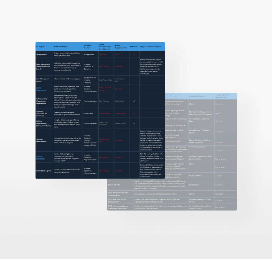
Dense table made scanning harder
No way to filter or find relevant updates easily.
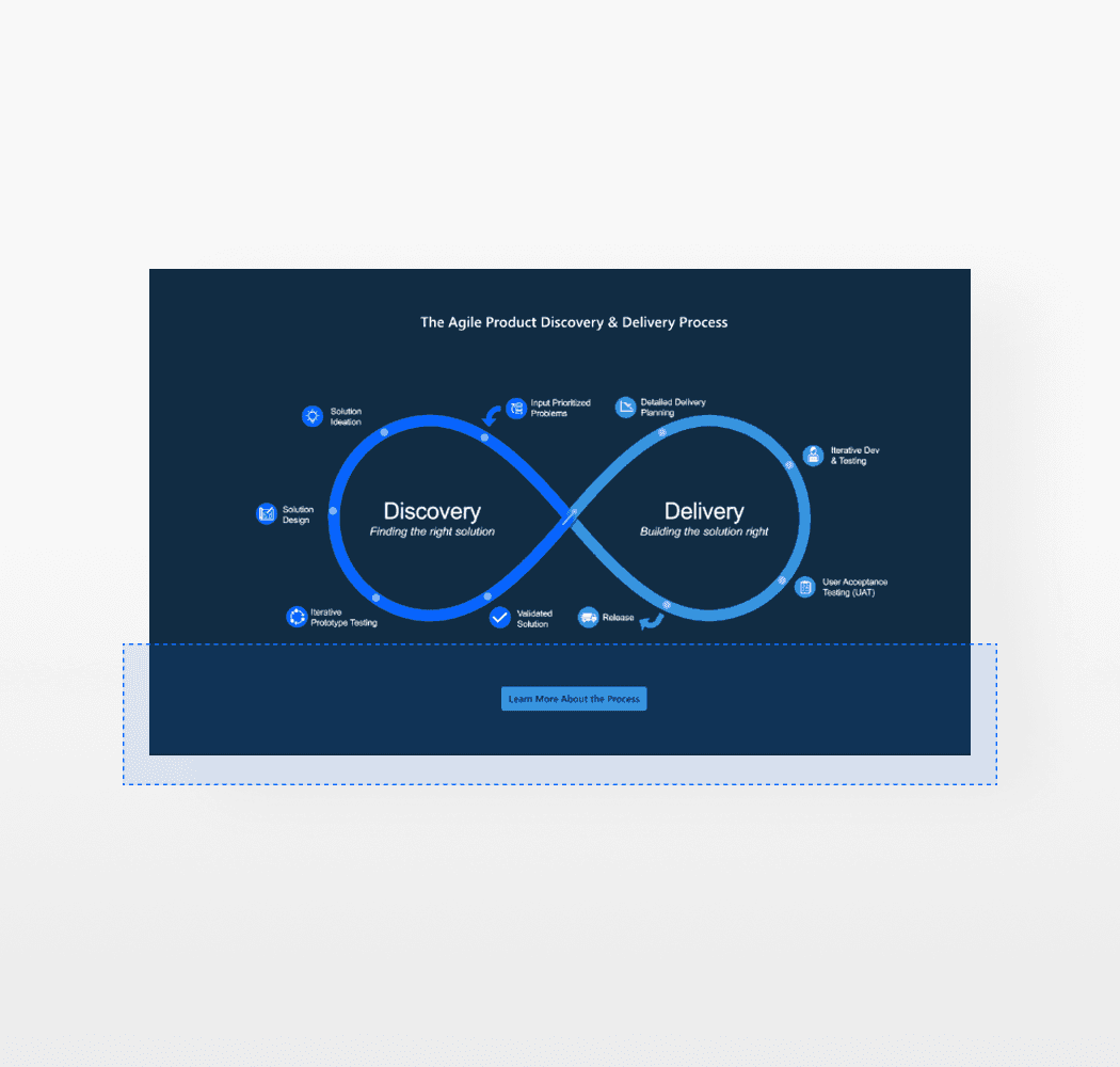
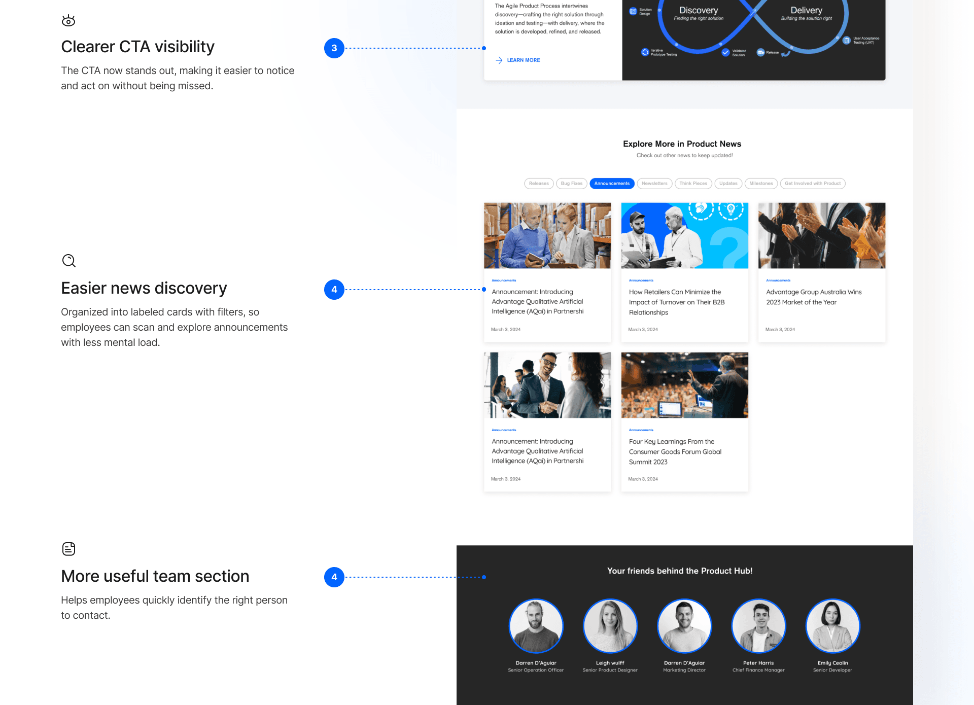
Less CTA visibility in Process section
Blended into the surrounding image and often missed.
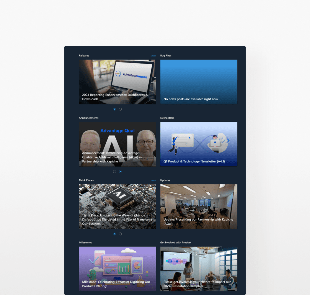
Too many updates, not enough control
Mixed newsletters across topics in one view, and no filter.
Competitive Research
Patterns from other companies' internal hubs
I looked into how other companies laid out their hubs and prioritized key information. This helped me shape the redesign direction around a clean dashboard style layout.
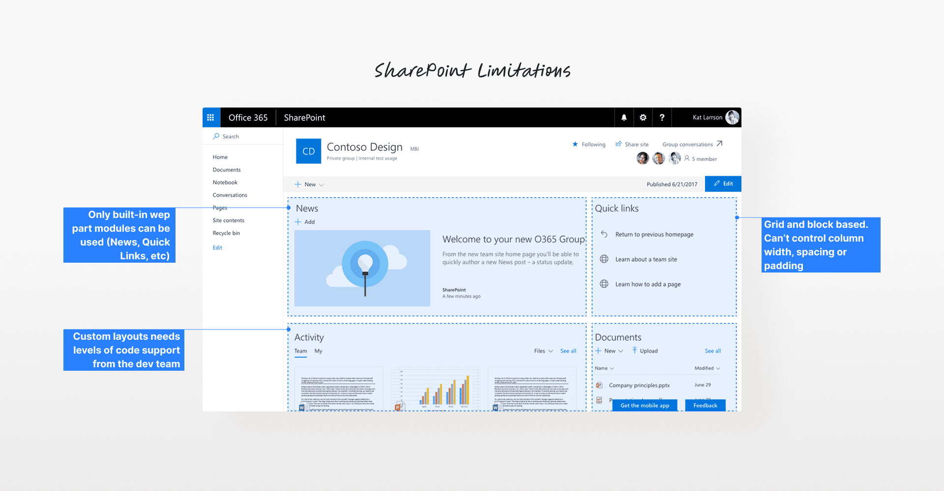
Working in Constraints
Learning SP limits and our company branding
In the meantime, I also had to quickly get up to speed with how SharePoint works. I explored the tool hands-on, tested different modules, and carefully reviewed our brand guidelines. Here’s what I learned along the way.
Ideation + Checkin
I jumped into rapid prototyping to quickly test ideas.
Since the timeline were tight, I jumped straight into hi-fi mockups and shared a design proposal doc with the Product team. Here’s some of the feedback on the initial prototype.
Feedback #1
“Should be some ways to compact the layout more for less scrolling.”
Feedback #2
“Any ideas to streamline the information in the table for quick scan?”
Feedback #3
“Still feeling it doesn’t reflect our branding enough, like the colour palette.”
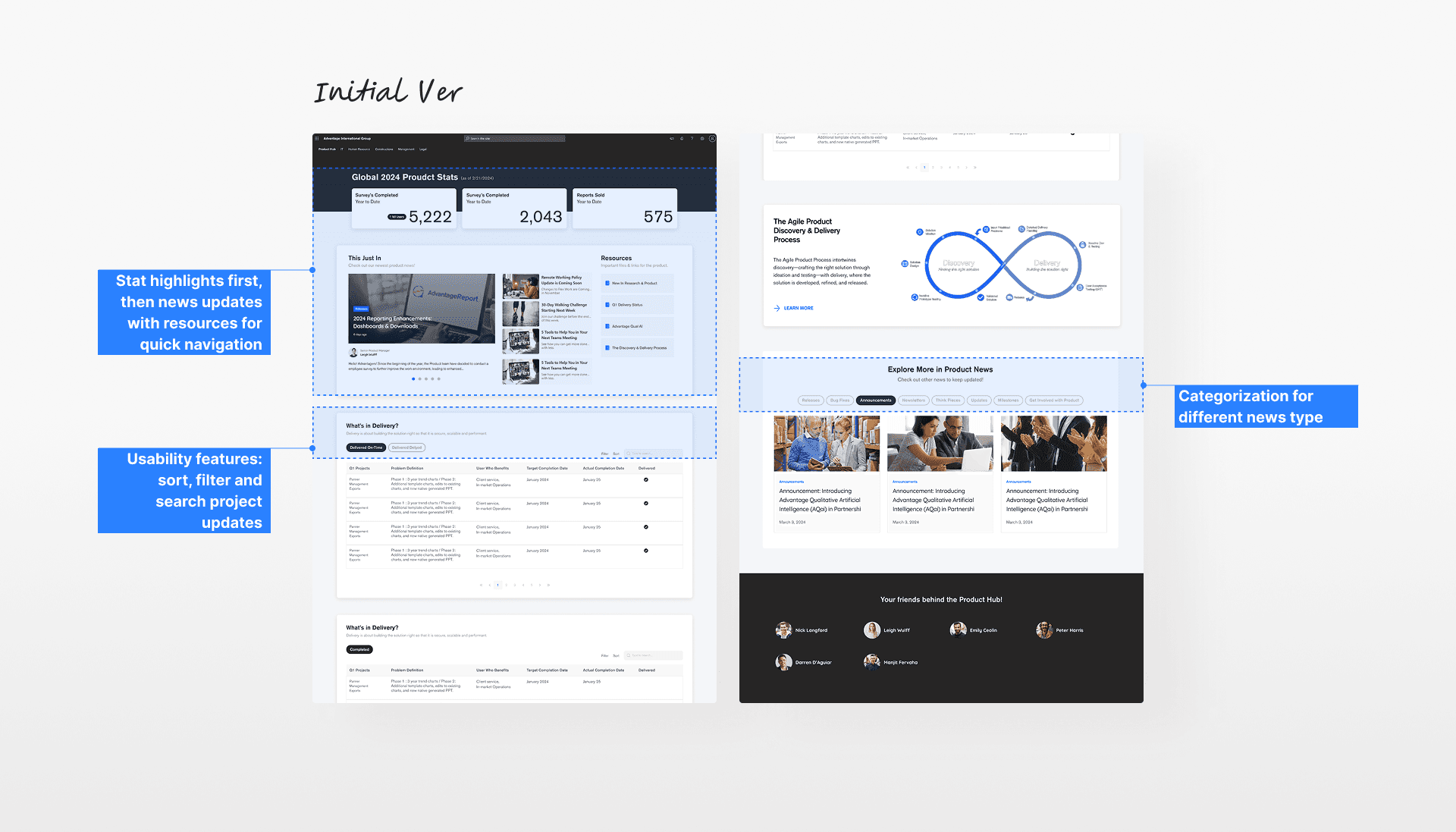
Design Iteration
Refining key sections based on early feedback
Afterwards, I focused my first iteration on the hero and table sections. Here, my goal was to address the feedback around the table complexity and weak branding.


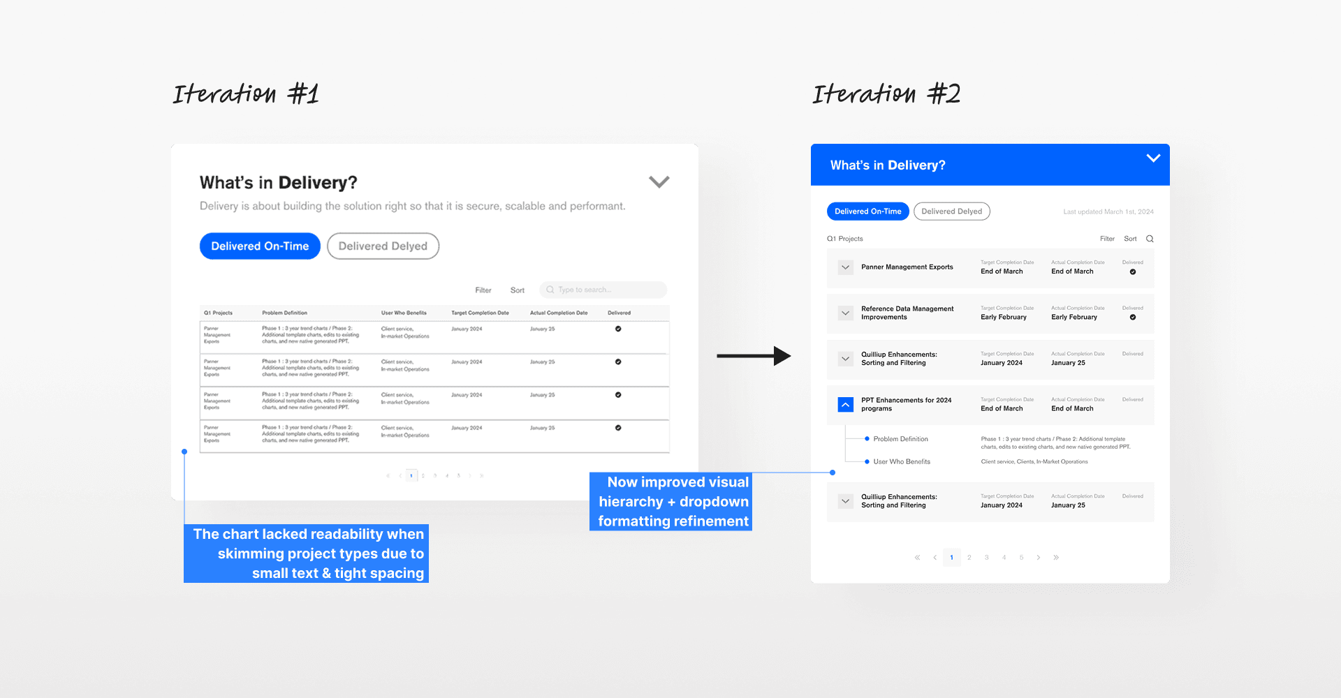
Feedback Loop + Key Refinement
However, many still found the revised table hard to read.
The font felt too small especially for longer descriptions. The tight spacing and packed rows also made it hard to scan quickly. So I went back and made the text bigger, added breathing room, and adjusted the layout so the important details are easier to spot.
Iteration #2: Table chart
Final Design
All set..but the Product hub didn’t go live.
While the document below was finalized and shared, this plan wasn’t implemented in the end, as we didn’t have an internal dev team. However, other redesigned hubs were successfully launched.
Signing Off
Did I achieve my goals?
Yes! Even with the short timeline and unexpected issues, I grew quickly by juggling deadlines, managing time, and collaborating cross-functionally. It pushed me to apply my goals in a real-world setting. Overall, it was a very rewarding learning experience to work in such a fast-paced environment.